
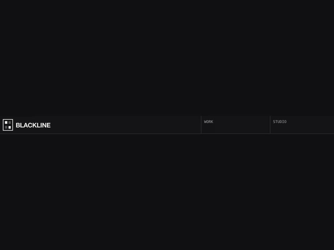
About
Pixel dither hover navbar for editorial sites: cells fill with a chunky left-to-right pixel dissolve on hover, with hairline-ruled cells, monospace caps, a wordmark that retracts on scroll and hover dropdowns. Self-contained: no CSS file, no images, no animation library.
Built with React and Tailwind. Copy the prompt and paste it into Claude Code, Cursor or Lovable: your agent adds Dither Sweep Navbar to your project and fits it to your theme.
Code
How Dither Sweep Navbar is used: the demo's code. The component's own source comes with a free account.
Usage.tsx
import React from "react"
import DitherSweepNavbar from "@/components/ui/dither-sweep-navbar"

/** The same bar, recoloured and rescaled, with no CTA. */
export default function DitherSweepNavbarStrictDemo() {
  return (
    <div
      className="grid w-full"
      style={{ minHeight: "100svh", alignContent: "center", background: "#101014" }}
    >
      <DitherSweepNavbar
        sticky={false}
        brand="Blackline"
        ink="#f2f2ec"
        paper="#101014"
        rule="#3a3a42"
        accent="#7cf6c8"
        scale={1.1}
        durationMs={700}
        cta={null}
        items={[
          { label: "Work", href: "#work" },
          { label: "Studio", children: [{ label: "Team", href: "#team" }, { label: "Process", href: "#process" }] },
          { label: "Journal", href: "#journal" },
        ]}
      />
    </div>
  )
}
More by Kedhareswer Naidu
View all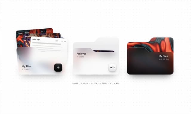

Glassmorphism Folder Cards
2.6K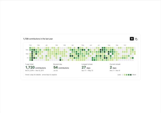
GitHub Contribution Graph 3D Heatmap
1.8K
Morph Gallery
1.4K
Halftone Wordmark Footer
1.1K
Glass Cards
716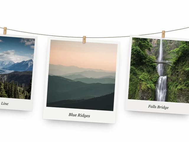
Hanging Polaroid Image Carousel
703
Particle Animation
644
Tiger Tear Reveal
637
More in Navigation
View all

Sidebar
231

Tabs
60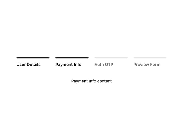
Progress Bar Stepper
36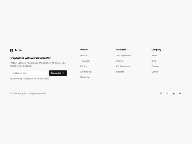
Newsletter Signup Footer
15

Footer 2
200
Navbar with Theme Toggle
43
Numberless Pagination with Text
11

Navbar
71
