
About
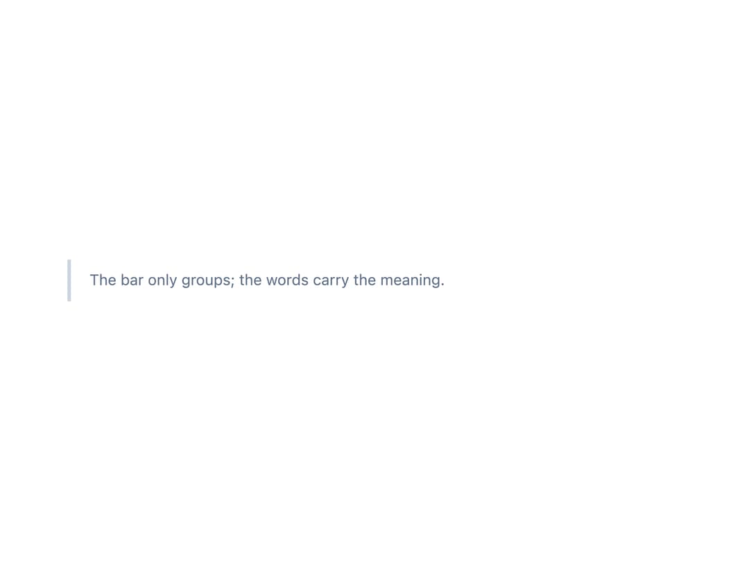
An inline aside with a leading edge bar and an optional tone icon, used to add a short explanatory remark beside the content it refers to without the heading or actions of a full banner.
Built with React and Tailwind. Copy the prompt and paste it into Claude Code, Cursor or Lovable: your agent adds Note to your project and fits it to your theme.
Code
How Note is used: the demo's code. The component's own source comes with a free account.
Usage.tsx
import Note from "@/components/ui/note";

export default function NoteDemo() {
  return (
    <div className="w-full max-w-xl p-6">
      <Note>The bar only groups; the words carry the meaning.</Note>
    </div>
  );
}
More by keshon
View all
List
1
Thinking
Lanes
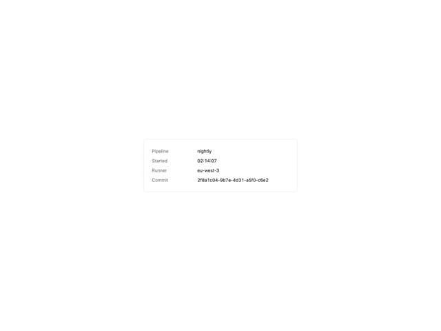
Key Value List
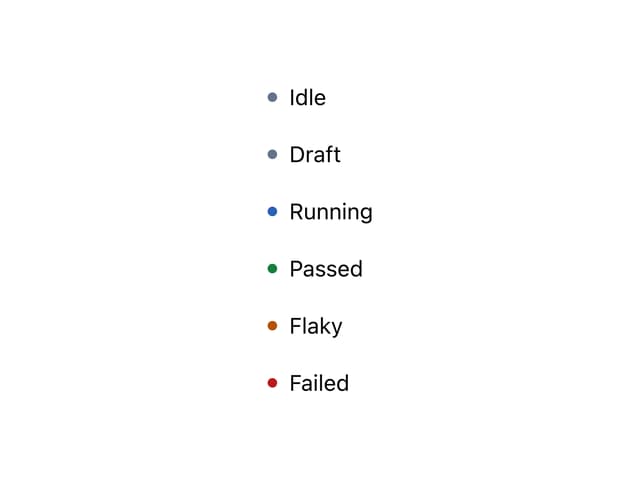
Status Dot
Spinner
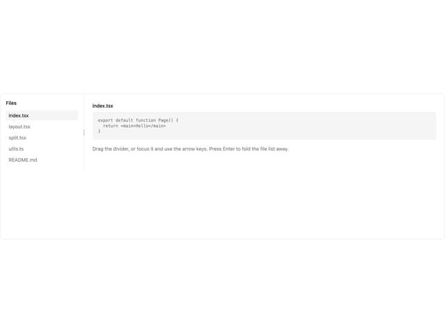
Split