
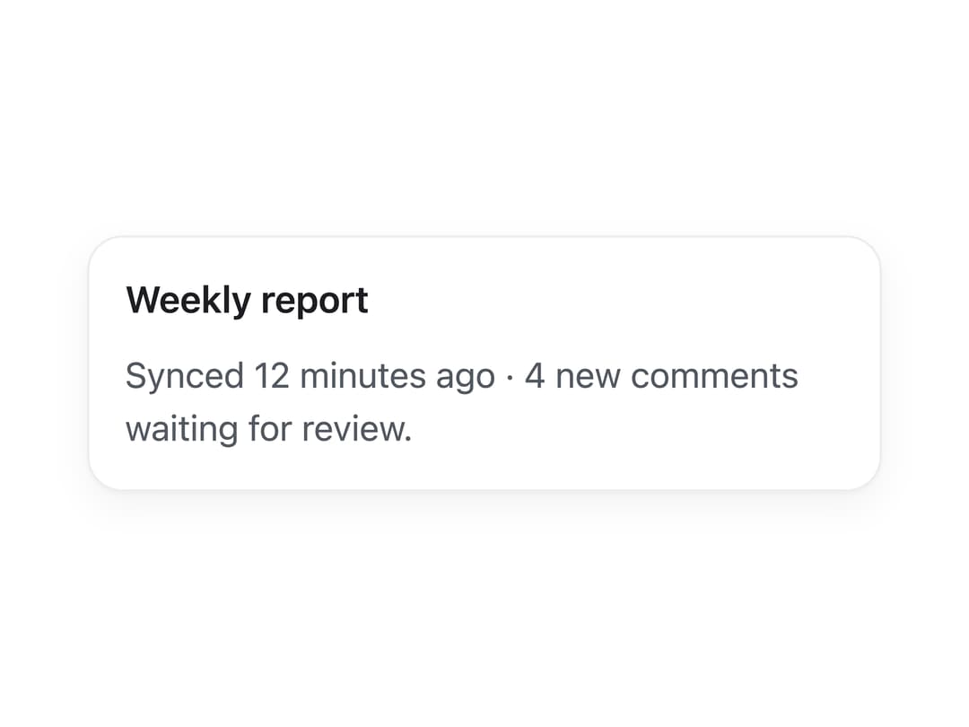
About
A themeable surface container for grouping related content, with an optional variant that turns the whole card into a link.
Built with React and Tailwind. Copy the prompt and paste it into Claude Code, Cursor or Lovable: your agent adds Card to your project and fits it to your theme.
Code
How Card is used: the demo's code. The component's own source comes with a free account.
Usage.tsx
import Card from "@/components/ui/card";

export default function CardDemo() {
  return (
    <div className="flex w-full min-h-[420px] items-center justify-center p-10">
      <Card style={{ maxWidth: 360 }}>
        <h3
          style={{
            margin: 0,
            fontSize: "1.05rem",
            fontWeight: 600,
            color: "var(--lk-font-color-base)",
          }}
        >
          Weekly report
        </h3>
        <p
          style={{
            marginTop: 8,
            marginBottom: 0,
            color: "var(--lk-font-color-secondary)",
          }}
        >
          Synced 12 minutes ago · 4 new comments waiting for review.
        </p>
      </Card>
    </div>
  );
}
Dependencies
More by lailai0916
View all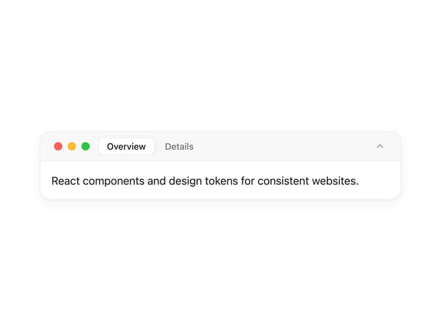
Window Panel
6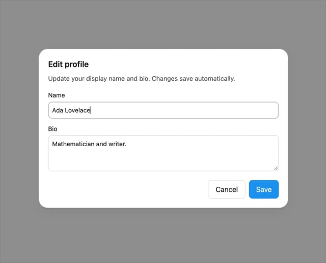
Dialog
1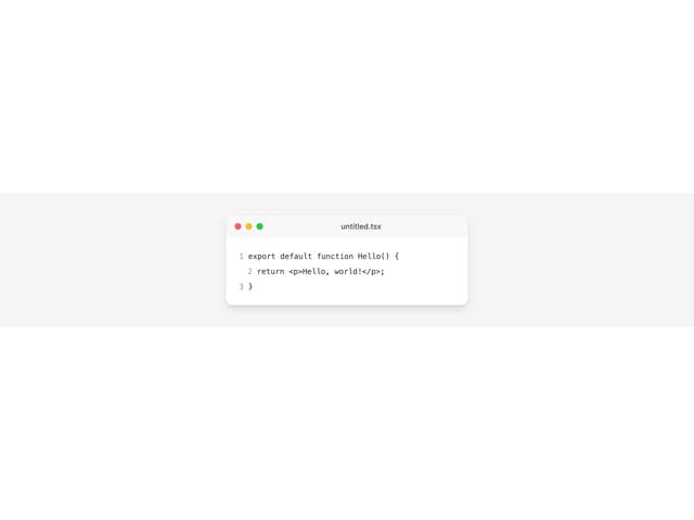
Window Bar
Tabs

Scrollable Data Table
Skip Link

Site Header

Skeleton
More in Cards
View all
Stats cards with links
33

Course Design Cards
1.1K

Card
70
Statistics Card 2
264
Statistics Card 10
263

Card
17

Card Studio
9
The Item one
3
