
About
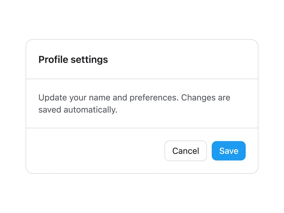
A bordered container with optional header, body and footer sections for grouping related content, forms or settings inside a card-like surface.
Built with React and Tailwind. Copy the prompt and paste it into Claude Code, Cursor or Lovable: your agent adds Panel to your project and fits it to your theme.
Code
How Panel is used: the demo's code. The component's own source comes with a free account.
Usage.tsx
import {
  Panel,
  PanelHeader,
  PanelBody,
  PanelFooter,
} from "@/components/ui/panel";

export default function PanelDemo() {
  return (
    <div className="flex w-full items-center justify-center p-10">
      <Panel className="w-full max-w-sm">
        <PanelHeader>
          <h3
            className="text-base font-semibold"
            style={{ color: "var(--lk-font-color-base)" }}
          >
            Profile settings
          </h3>
        </PanelHeader>
        <PanelBody>
          <p
            className="text-sm"
            style={{ color: "var(--lk-font-color-secondary)" }}
          >
            Update your name and preferences. Changes are saved automatically.
          </p>
        </PanelBody>
        <PanelFooter>
          <div className="flex items-center justify-end gap-2">
            <button
              className="rounded-md border px-3 py-1.5 text-sm"
              style={{
                color: "var(--lk-font-color-base)",
                borderColor: "var(--lk-color-emphasis-300)",
              }}
              type="button"
            >
              Cancel
            </button>
            <button
              className="rounded-md px-3 py-1.5 text-sm font-medium text-white"
              style={{ background: "var(--lk-color-primary)" }}
              type="button"
            >
              Save
            </button>
          </div>
        </PanelFooter>
      </Panel>
    </div>
  );
}
More by lailai0916
View all
Window Panel
6
Dialog
1
Window Bar
Tabs

Scrollable Data Table
Skip Link
Site Header

Skeleton
More in Cards
View all
Stats cards with links
33

Course Design Cards
1.1K

Card
70
Statistics Card 2
264
Statistics Card 10
263

Card
17

Card Studio
9
The Item one
3
