About
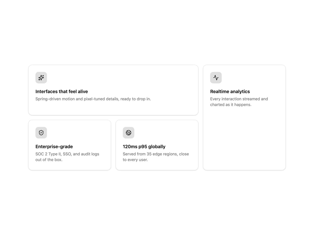
A responsive grid of mixed-size cards for showcasing features or product highlights, with spring-driven stagger-in on scroll, hover lift, and a pointer-tracked spotlight glow.
Built with React and Tailwind. Copy the prompt and paste it into Claude Code, Cursor or Lovable: your agent adds Bento Grid to your project and fits it to your theme.
Code
How Bento Grid is used: the demo's code. The component's own source comes with a free account.
Usage.tsx
import { BentoGrid, BentoCard } from "@/components/ui/bento-grid";
import { Sparkles, Activity, ShieldCheck, Globe2 } from "lucide-react";

const iconWrap =
  "inline-flex size-10 items-center justify-center rounded-lg bg-primary/10 text-primary";

export default function BentoGridDemo() {
  return (
    <BentoGrid className="max-w-4xl">
      <BentoCard
        colSpan={2}
        icon={
          <span className={iconWrap}>
            <Sparkles className="size-5" />
          </span>
        }
        title="Interfaces that feel alive"
        description="Spring-driven motion and pixel-tuned details, ready to drop in."
      />
      <BentoCard
        rowSpan={2}
        icon={
          <span className={iconWrap}>
            <Activity className="size-5" />
          </span>
        }
        title="Realtime analytics"
        description="Every interaction streamed and charted as it happens."
      />
      <BentoCard
        icon={
          <span className={iconWrap}>
            <ShieldCheck className="size-5" />
          </span>
        }
        title="Enterprise-grade"
        description="SOC 2 Type II, SSO, and audit logs out of the box."
      />
      <BentoCard
        icon={
          <span className={iconWrap}>
            <Globe2 className="size-5" />
          </span>
        }
        title="120ms p95 globally"
        description="Served from 35 edge regions, close to every user."
      />
    </BentoGrid>
  );
}
Dependencies
More by lucasbassetti
View all

Multi Button
19
Magic Button
8
Mask Button
7
Animated Tooltip
6
Progress Fold Button
3
More in Features
View all

Features 8
3.1K

Feature Sections
107

Grid Feature Cards
1.9K

Feature 72
122
Features 2
322
Feature Modern
9
Features 4
368
Features Card
201

