About
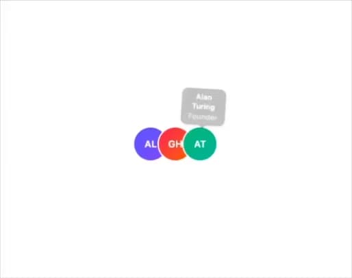
A hover/focus tooltip that springs in and tilts in 3D as the pointer moves across its trigger element.
Built with React and Tailwind. Copy the prompt and paste it into Claude Code, Cursor or Lovable: your agent adds Animated Tooltip to your project and fits it to your theme.
Code
How Animated Tooltip is used: the demo's code. The component's own source comes with a free account.
Usage.tsx
"use client";

import { AnimatedTooltip } from "@/components/ui/animated-tooltip";

const team = [
  {
    name: "Ada Lovelace",
    role: "Design Engineer",
    initials: "AL",
    gradient: "from-indigo-500 to-violet-500",
  },
  {
    name: "Grace Hopper",
    role: "Staff Engineer",
    initials: "GH",
    gradient: "from-rose-500 to-orange-500",
  },
  {
    name: "Alan Turing",
    role: "Founder",
    initials: "AT",
    gradient: "from-emerald-500 to-teal-500",
  },
];

export default function AnimatedTooltipDemo() {
  return (
    <div className="flex h-screen w-full items-center justify-center bg-background">
      <div className="flex">
        {team.map((m) => (
          <AnimatedTooltip
            key={m.name}
            className="-ml-3 first:ml-0"
            content={
              <span className="flex flex-col">
                <span className="font-semibold">{m.name}</span>
                <span className="text-background/70">{m.role}</span>
              </span>
            }
          >
            <span
              className={`flex size-12 items-center justify-center rounded-full bg-gradient-to-br ${m.gradient} text-sm font-semibold text-white ring-2 ring-background`}
            >
              {m.initials}
            </span>
          </AnimatedTooltip>
        ))}
      </div>
    </div>
  );
}
Dependencies
More by lucasbassetti
View all

Multi Button
19
Magic Button
8
Mask Button
7
Progress Fold Button
3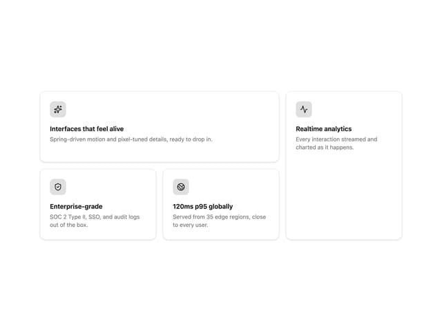
Bento Grid
More in Cards
View all
Stats cards with links
120

Course Design Cards
1.1K

Statistics Card 2
259
Card
56

Card Studio
9
Statistics Card 7
289
The Item one
3

Weather Card
53
