
About
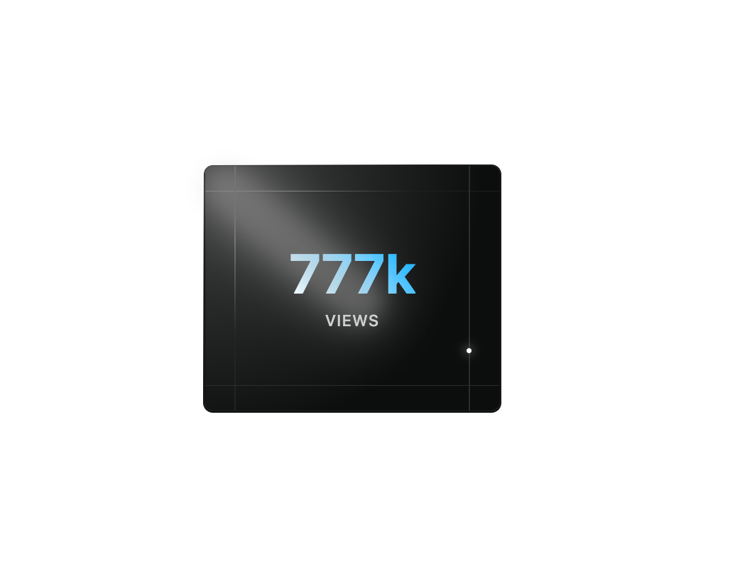
A dynamic views counter card featuring an animated dot traversing the border, gradient-highlighted count display, and stylized corner lines for a sci-fi UI effect
Built with React and Tailwind. Copy the prompt and paste it into Claude Code, Cursor or Lovable: your agent adds Moving Dot Card to your project and fits it to your theme.
Code
How Moving Dot Card is used: the demo's code. The component's own source comes with a free account.
Usage.tsx
import DotCard from "@/components/ui/moving-dot-card";

const DemoOne = () => {
  return (
    <div className="flex w-full h-screen justify-center items-center">
      <DotCard />
      </div>
  );
};

export { DemoOne };
More by Le Thanh
View all
Interactive Image Accordion
4.2K
Interactive Selector
2.6K
Gradient Menu
2.3K
Animated Shader Background
2.1K
Shader Background
2K
Waitlist Hero
1.8K
Image Comparison Slider
1.6K
Digital Serenity - Animated Landing Page
1.4K
More in Cards
View all

Statistics Card 2
264

Course Design Cards
1.1K
Card
70
Stats cards with links
39
The Item one
3

Card Studio
7
Statistics Card 7
292

Item
10
