
About
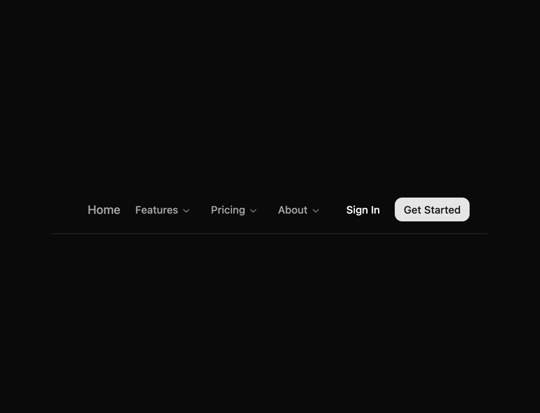
Here is Navigation Bar component
Built with React and Tailwind. Copy the prompt and paste it into Claude Code, Cursor or Lovable: your agent adds Navigation Bar to your project and fits it to your theme.
Code
How Navigation Bar is used: the demo's code. The component's own source comes with a free account.
Usage.tsx
import { BookOpenIcon, InfoIcon, LifeBuoyIcon } from "lucide-react"
import { cn } from "@/lib/utils"
import { Button } from "@/components/ui/button"
import {
NavigationMenu,
NavigationMenuContent,
NavigationMenuItem,
NavigationMenuLink,
NavigationMenuList,
NavigationMenuTrigger,
NavigationMenuViewport,
} from "@/components/ui/navigation-menu"
import {
Popover,
PopoverContent,
PopoverTrigger,
} from "@/components/ui/popover"
// Navigation links array to be used in both desktop and mobile menus
const navigationLinks = [
{ href: "#", label: "Home" },
{
label: "Features",
submenu: true,
type: "description",
items: [
{
href: "#",
label: "Components",
description: "Browse all components in the library.",
},
{
href: "#",
label: "Documentation",
description: "Learn how to use the library.",
},
{
href: "#",
label: "Templates",
description: "Pre-built layouts for common use cases.",
},
],
},
{
label: "Pricing",
submenu: true,
type: "simple",
items: [
{ href: "#", label: "Product A" },
{ href: "#", label: "Product B" },
{ href: "#", label: "Product C" },
{ href: "#", label: "Product D" },
],
},
{
label: "About",
submenu: true,
type: "icon",
items: [
{ href: "#", label: "Getting Started", icon: "BookOpenIcon" },
{ href: "#", label: "Tutorials", icon: "LifeBuoyIcon" },
{ href: "#", label: "About Us", icon: "InfoIcon" },
],
},
]
export default function Component() {
return (
<header className="border-b px-4 md:px-6">
<div className="flex h-16 items-center justify-between gap-4">
{/* Left side */}
<div className="flex items-center gap-2">
{/* Mobile menu trigger */}
<Popover>
<PopoverTrigger asChild>
<Button
className="group size-8 md:hidden"
variant="ghost"
size="icon"
>
<svg
className="pointer-events-none"
width={16}
height={16}
viewBox="0 0 24 24"
fill="none"
stroke="currentColor"
strokeWidth="2"
strokeLinecap="round"
strokeLinejoin="round"
xmlns="http://www.w3.org/2000/svg"
>
<path
d="M4 12L20 12"
className="origin-center -translate-y-[7px] transition-all duration-300 ease-[cubic-bezier(.5,.85,.25,1.1)] group-aria-expanded:translate-x-0 group-aria-expanded:translate-y-0 group-aria-expanded:rotate-[315deg]"
/>
<path
d="M4 12H20"
className="origin-center transition-all duration-300 ease-[cubic-bezier(.5,.85,.25,1.8)] group-aria-expanded:rotate-45"
/>
<path
d="M4 12H20"
className="origin-center translate-y-[7px] transition-all duration-300 ease-[cubic-bezier(.5,.85,.25,1.1)] group-aria-expanded:translate-y-0 group-aria-expanded:rotate-[135deg]"
/>
</svg>
</Button>
</PopoverTrigger>
<PopoverContent align="start" className="w-64 p-1 md:hidden">
<NavigationMenu className="max-w-none *:w-full">
<NavigationMenuList className="flex-col items-start gap-0 md:gap-2">
{navigationLinks.map((link, index) => (
<NavigationMenuItem key={index} className="w-full">
{link.submenu ? (
<>
<div className="text-muted-foreground px-2 py-1.5 text-xs font-medium">
{link.label}
</div>
<ul>
{link.items.map((item, itemIndex) => (
<li key={itemIndex}>
<NavigationMenuLink
href={item.href}
className="py-1.5"
>
{item.label}
</NavigationMenuLink>
</li>
))}
</ul>
</>
) : (
<NavigationMenuLink href={link.href} className="py-1.5">
{link.label}
</NavigationMenuLink>
)}
{/* Add separator between different types of items */}
{index < navigationLinks.length - 1 &&
// Show separator if:
// 1. One is submenu and one is simple link OR
// 2. Both are submenus but with different types
((!link.submenu &&
navigationLinks[index + 1].submenu) ||
(link.submenu &&
!navigationLinks[index + 1].submenu) ||
(link.submenu &&
navigationLinks[index + 1].submenu &&
link.type !== navigationLinks[index + 1].type)) && (
<div
role="separator"
aria-orientation="horizontal"
className="bg-border -mx-1 my-1 h-px w-full"
/>
)}
</NavigationMenuItem>
))}
</NavigationMenuList>
</NavigationMenu>
</PopoverContent>
</Popover>
{/* Main nav */}
<div className="flex items-center gap-6">
<a href="#" className="text-primary hover:text-primary/90">
Logo
</a>
{/* Navigation menu */}
<div className="max-md:hidden">
<NavigationMenu>
<NavigationMenuList>
{navigationLinks.map((link, index) => (
<NavigationMenuItem key={index}>
{link.submenu ? (
<>
<NavigationMenuTrigger className="text-muted-foreground hover:text-primary bg-transparent px-2 py-1.5 font-medium">
{link.label}
</NavigationMenuTrigger>
<NavigationMenuContent>
<ul className={cn(
"grid w-[400px] gap-3 p-4 md:w-[500px] md:grid-cols-2 lg:w-[600px]",
link.type === "description" && "md:grid-cols-1"
)}>
{link.items.map((item, itemIndex) => (
<li key={itemIndex}>
<NavigationMenuLink asChild>
<a
href={item.href}
className="block select-none space-y-1 rounded-md p-3 leading-none no-underline outline-none transition-colors hover:bg-accent hover:text-accent-foreground focus:bg-accent focus:text-accent-foreground"
>
{/* Display icon if present */}
{link.type === "icon" && "icon" in item && (
<div className="flex items-center gap-2">
{item.icon === "BookOpenIcon" && (
<BookOpenIcon
size={16}
className="text-foreground opacity-60"
aria-hidden="true"
/>
)}
{item.icon === "LifeBuoyIcon" && (
<LifeBuoyIcon
size={16}
className="text-foreground opacity-60"
aria-hidden="true"
/>
)}
{item.icon === "InfoIcon" && (
<InfoIcon
size={16}
className="text-foreground opacity-60"
aria-hidden="true"
/>
)}
<div className="text-sm font-medium leading-none">
{item.label}
</div>
</div>
)}
{/* Display label with description if present */}
{link.type === "description" && "description" in item && (
<>
<div className="text-sm font-medium leading-none">
{item.label}
</div>
<p className="line-clamp-2 text-sm leading-snug text-muted-foreground">
{item.description}
</p>
</>
)}
{/* Display simple label if simple type */}
{link.type === "simple" && (
<div className="text-sm font-medium leading-none">
{item.label}
</div>
)}
</a>
</NavigationMenuLink>
</li>
))}
</ul>
</NavigationMenuContent>
</>
) : (
<NavigationMenuLink asChild>
<a
href={link.href}
className="text-muted-foreground hover:text-primary py-1.5 px-2 font-medium"
>
{link.label}
</a>
</NavigationMenuLink>
)}
</NavigationMenuItem>
))}
</NavigationMenuList>
<NavigationMenuViewport />
</NavigationMenu>
</div>
</div>
</div>
{/* Right side */}
<div className="flex items-center gap-2">
<Button asChild variant="ghost" size="sm" className="text-sm">
<a href="#">Sign In</a>
</Button>
<Button asChild size="sm" className="text-sm">
<a href="#">Get Started</a>
</Button>
</div>
</div>
</header>
)
}Dependencies
More by Origin UI
View all
Dialog
1.2K
Avatar
948
useImageUpload
924
usePagination
622
Popover
382
Button
361
Command
319
Accordion
256
More in Buttons
View all

Button
4

Button
47

App Store Button
452

Eclipse Button
39
Texture Button
92
Split Button
14
Native Button
12
Button Save
46


