About
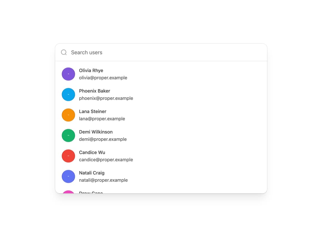
A searchable ⌘K-style command palette for filtering and selecting actions, settings or people from a keyboard-first popover or inline list.
Built with React and Tailwind. Copy the prompt and paste it into Claude Code, Cursor or Lovable: your agent adds Command Menu to your project and fits it to your theme.
Code
How Command Menu is used: the demo's code. The component's own source comes with a free account.
Usage.tsx
import { CommandMenu } from "@/components/ui/command-menu";
import { AVATARS } from "@/components/ui/command-menu-utils/demo-assets";

export default function CommandMenuUsersDemo() {
  return (
    <CommandMenu layout="stacked" defaultValue="">
      <CommandMenu.Search placeholder="Search users" />
      <CommandMenu.List
        items={AVATARS}
        renderEmptyState={() => (
          <CommandMenu.Empty description="Try a different search." />
        )}
      >
        {(user) => (
          <CommandMenu.Item
            key={user.username}
            id={user.username}
            label={user.name}
            description={user.email}
            avatarUrl={user.src}
            avatarAlt={user.alt}
          />
        )}
      </CommandMenu.List>
    </CommandMenu>
  );
}
Dependencies
More by properui
View all

Loading Indicator
7
Breadcrumbs
Toggle
Tags
Progress Indicators

Radio Buttons
Button
Badge