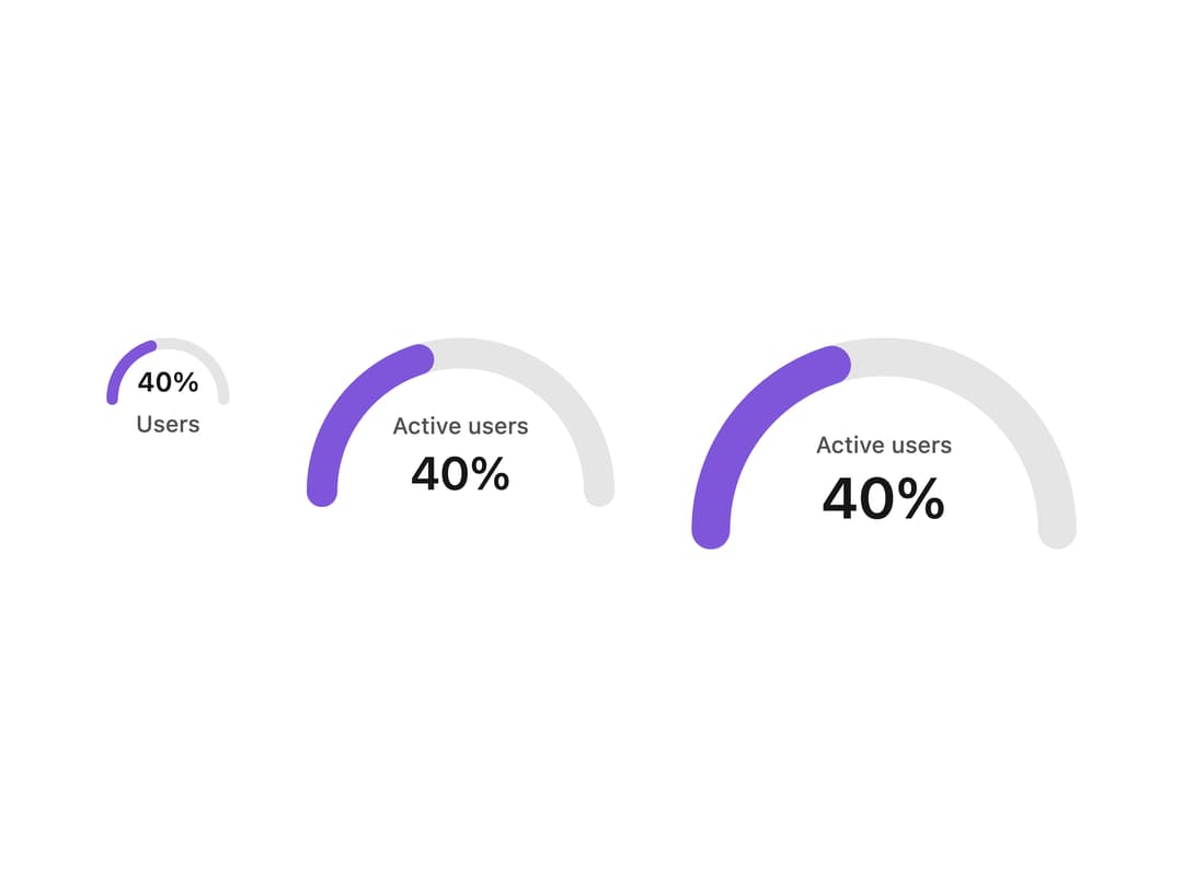
About
A progress bar and circular/half-circle progress ring for showing how far a determinate task (upload, multi-step flow, loading) has completed, with optional right/bottom/floating percentage labels.
Built with React and Tailwind. Copy the prompt and paste it into Claude Code, Cursor or Lovable: your agent adds Progress Indicators to your project and fits it to your theme.
Code
How Progress Indicators is used: the demo's code. The component's own source comes with a free account.
Usage.tsx
import { ProgressBarHalfCircle } from "@/components/ui/progress-indicators-utils/progress-circles";

export default function HalfCircleProgressBarLabelDemo() {
  return (
    <div className="flex flex-col items-start gap-10 md:flex-row">
      <ProgressBarHalfCircle
        size="xxs"
        label="Users"
        min={0}
        max={100}
        value={40}
      />
      <ProgressBarHalfCircle
        size="xs"
        label="Active users"
        min={0}
        max={100}
        value={40}
      />
      <ProgressBarHalfCircle
        size="sm"
        label="Active users"
        min={0}
        max={100}
        value={40}
      />
    </div>
  );
}
More by properui
View all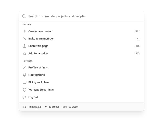

Command Menu
13
Loading Indicator
7
Breadcrumbs
Toggle
Tags

Radio Buttons
Button
Badge