About
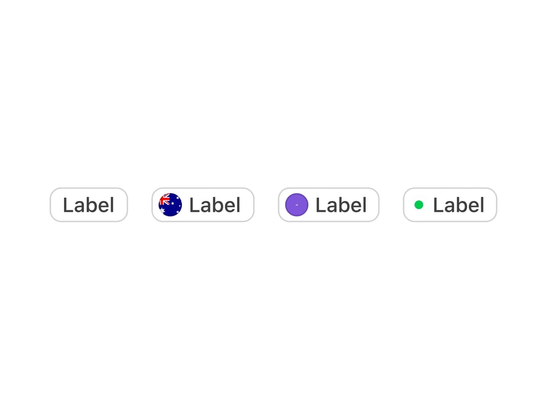
A group of chip-style tags built with React Aria that a user can select, filter by, or remove, with optional avatars, status dots, and counts.
Built with React and Tailwind. Copy the prompt and paste it into Claude Code, Cursor or Lovable: your agent adds Tags to your project and fits it to your theme.
Code
How Tags is used: the demo's code. The component's own source comes with a free account.
Usage.tsx
"use client";

import { Tag, TagGroup, TagList } from "@/components/ui/tags";

const AU_FLAG =
  "https://cdn.21st.dev/assets/localized/cbb2206c5e59a25d79228306af973666a191e163f0ae337681f447977e6edb18.svg";
const AVATAR_SRC =
  "https://cdn.21st.dev/assets/localized/aef1dddf3f0a7db7576b169903741465d2f7afebd0666243376970fa95f6e00a.svg";

export default function TagsDemo() {
  return (
    <TagGroup label="Tags" size="md">
      <TagList className="flex gap-4">
        <Tag>Label</Tag>
        <Tag avatarSrc={AU_FLAG}>Label</Tag>
        <Tag avatarSrc={AVATAR_SRC}>Label</Tag>
        <Tag dot={true}>Label</Tag>
      </TagList>
    </TagGroup>
  );
}
Dependencies
More by properui
View all

Command Menu
13
Loading Indicator
7
Breadcrumbs
Toggle
Progress Indicators
Radio Buttons
Button
Badge