
About
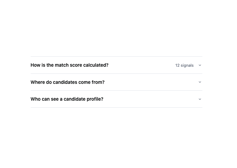
A collapsible list of sections where opening one typically closes the others, used for FAQs and long settings pages where readers skim rather than compare.
Built with React and Tailwind. Copy the prompt and paste it into Claude Code, Cursor or Lovable: your agent adds Accordion to your project and fits it to your theme.
Code
How Accordion is used: the demo's code. The component's own source comes with a free account.
Usage.tsx
import Accordion from "@/components/ui/accordion";

export default function AccordionDemo() {
  const items = [
    {
      id: "scoring",
      title: "How is the match score calculated?",
      meta: "12 signals",
      content:
        "Skills, seniority, location and availability are weighted per role. The weights are set on the role page and can be changed at any time.",
    },
    {
      id: "sources",
      title: "Where do candidates come from?",
      content:
        "Direct applications, the talent pool, and any ATS you have connected.",
    },
    {
      id: "privacy",
      title: "Who can see a candidate profile?",
      content:
        "Everyone in the workspace with reviewer access. Contact details are only revealed at the interview stage.",
    },
  ];

  return (
    <div
      style={{
        maxWidth: 560,
        width: "100%",
        fontFamily: "var(--font-sans)",
        color: "var(--ink-primary)",
      }}
    >
      <Accordion items={items} defaultOpen="scoring" />
    </div>
  );
}
More by redrob-labs
View all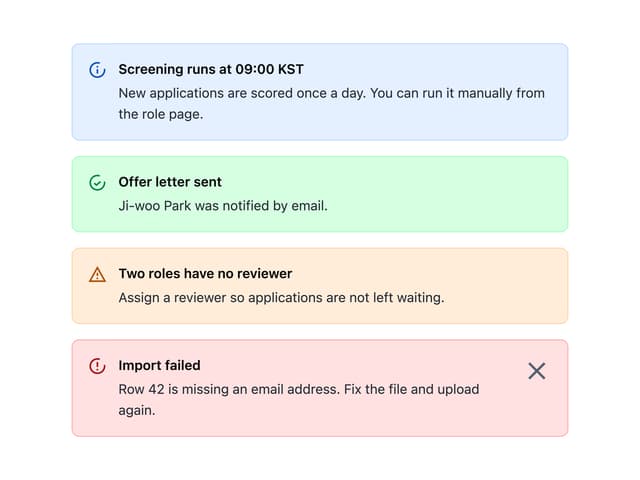
Alert
18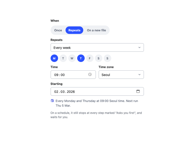
Schedule Picker
15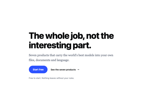
Hero Section
7
Switch
5
Status Card
4
Meter
2
Memory Scope
2
Checkbox