

About
A page-top hero layout with a statement heading, supporting lede, one primary action and a secondary link, optionally paired with a media figure or an autoplaying background film.
Built with React and Tailwind. Copy the prompt and paste it into Claude Code, Cursor or Lovable: your agent adds Hero Section to your project and fits it to your theme.
Code
How Hero Section is used: the demo's code. The component's own source comes with a free account.
Usage.tsx
import Hero from "@/components/ui/hero";

export default function HeroDemo() {
  return (
    <div style={{ padding: "64px 24px" }}>
      <Hero
        lede="Seven products that carry the world's best models into your own files, documents and language."
        action={
          <button
            type="button"
            className="rr-btn rr-btn--primary rr-btn--lg rr-btn--pill"
          >
            Start free
          </button>
        }
        secondary="See the seven products"
        secondaryHref="#products"
        foot="Free to start. Nothing leaves without your rules."
      >
        <h1
          style={{
            margin: 0,
            fontWeight: 800,
            fontSize: 56,
            lineHeight: "60px",
            letterSpacing: "-0.03em",
            color: "var(--ink-primary)",
          }}
        >
          The whole job, not the interesting part.
        </h1>
      </Hero>
    </div>
  );
}
More by redrob-labs
View all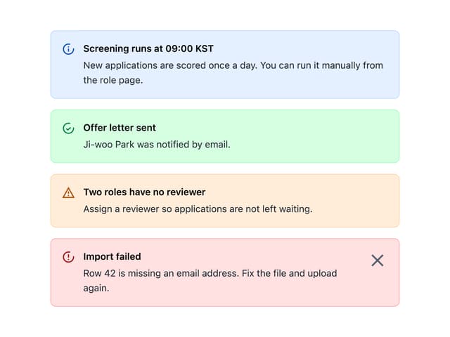
Alert
18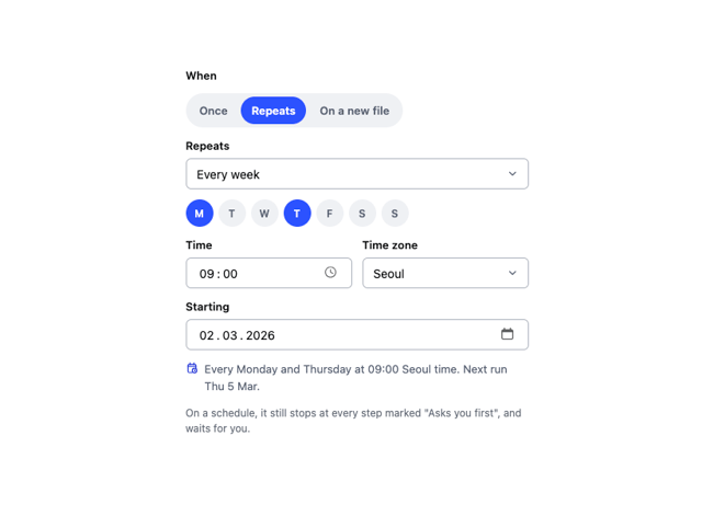
Schedule Picker
15
Switch
5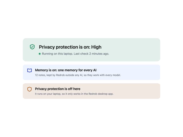
Status Card
4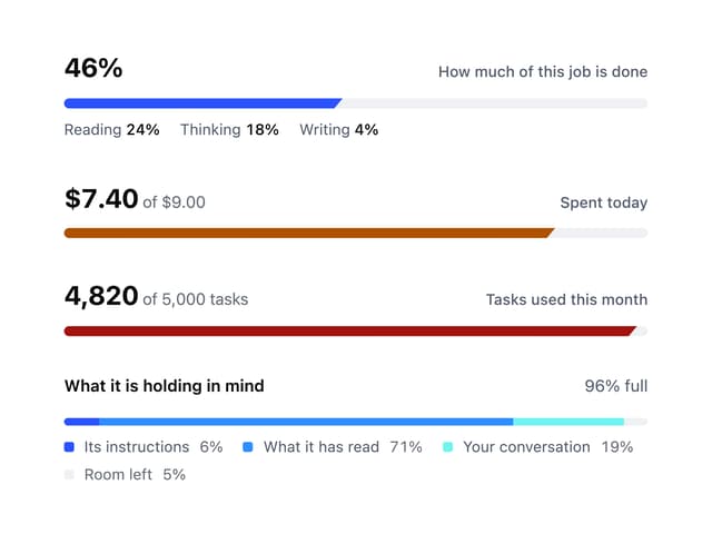
Meter
2
Memory Scope
2
Accordion
2
Checkbox
More in Heroes
View all

SaaS Template
2.4K
Centered Hero with Image Fan
924

Hero
1.2K

Responsive Hero Banner
2K

Hero Section 6
881
Hero Golden Spiral
101

Home Section
65

Minimalist Hero Fashion
284
