
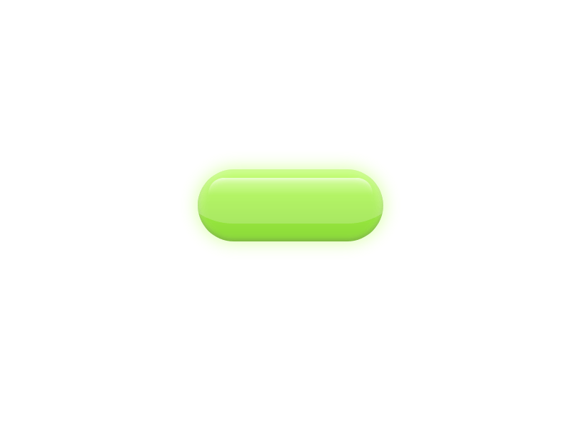
The GlowButton component is a beautifully crafted, interactive button that delivers a premium, modern feel through smooth animations and subtle lighting effects. Designed using Framer Motion and Tailwind CSS, it features a pearl-like gradient background with dynamic inner shadows and glowing highlights that softly react to user interactions. On hover, the button scales up gracefully with a spring-based transition, while the inner reflections and glow layers shift delicately to create a sense of depth and realism. Its sleek motion, gentle light diffusion, and responsive feedback make the GlowButton ideal for high-end interfaces, landing pages, and any design that aims to blend elegance with interactivity.
Built with React and Tailwind. Copy the prompt and paste it into Claude Code, Cursor or Lovable: your agent adds GlowButton to your project and fits it to your theme.
Code
How GlowButton is used: the demo's code. The component's own source comes with a free account.
Usage.tsx
import React from "react";
import GlowButton from "@/components/ui/glow-button";

export default function PearlButtonDemo() {
  return (
    <GlowButton label="Ruvy Button" />
  );
}
Dependencies
More by ruhith
View all
LoadingLines
145
Health Stat Card
138
LoadingRadar
119
LoadingBottle
114
BarLoader
90
Loader
71
BouncingCirclesLoader
50
LoaderProgressiveBar
49
More in Buttons
View all
Button Save
46

Button
20

Eclipse Button
5

Button
6

Button
14

Button Group
37

Button
32
Split Button
32

