
The HeroGlobe component is a visually striking hero section featuring an interactive 3D globe that represents global connectivity and innovation. It blends motion, depth, and modern design to capture attention instantly while symbolizing a worldwide reach. The globe rotates smoothly with subtle glow and particle effects, adapting beautifully to both dark and light themes. This component is perfect for landing pages that emphasize technology, global communities, or AI-driven platforms — combining aesthetics and performance to deliver an immersive first impression that feels both futuristic and professional.
Built with React and Tailwind. Copy the prompt and paste it into Claude Code, Cursor or Lovable: your agent adds PulseDivider to your project and fits it to your theme.
Code
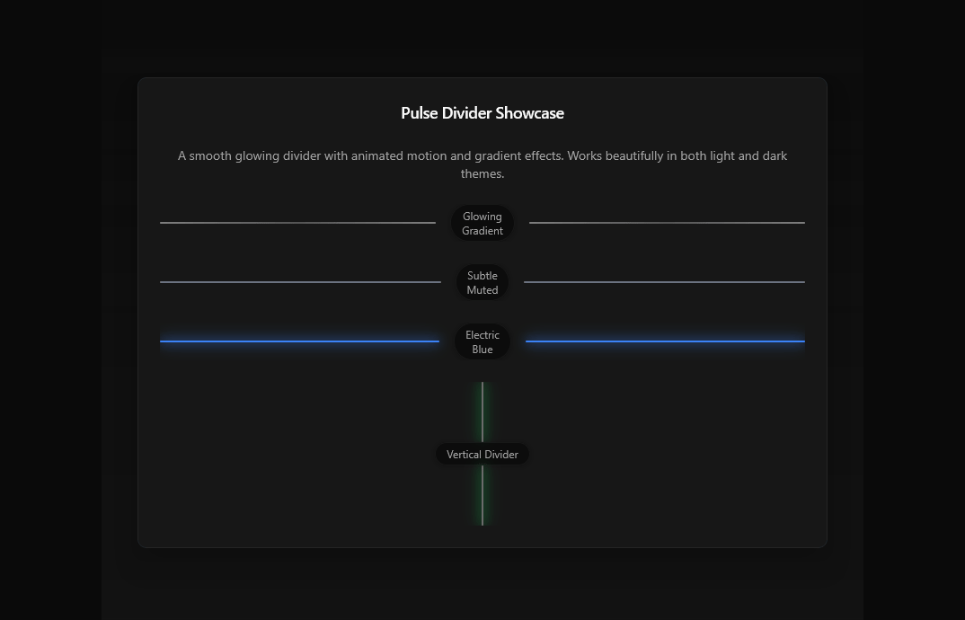
How PulseDivider is used: the demo's code. The component's own source comes with a free account.
Usage.tsx
"use client";

import React from "react";
import { PulseDivider } from "@/components/ui/pulse-divider";
import { Card, CardContent, CardHeader, CardTitle } from "@/components/ui/card";

export default function PulseDividerDemo() {
  return (
    <div className="min-h-screen flex flex-col items-center justify-center bg-gradient-to-b from-background to-muted/30 p-10">
      <Card className="max-w-3xl w-full border-border/60 shadow-xl">
        <CardHeader>
          <CardTitle className="text-center text-lg font-semibold">
            Pulse Divider Showcase
          </CardTitle>
        </CardHeader>
        <CardContent className="space-y-10">
          <div className="text-center space-y-6">
            <p className="text-sm text-muted-foreground">
              A smooth glowing divider with animated motion and gradient effects.
              Works beautifully in both light and dark themes.
            </p>

            <PulseDivider label="Glowing Gradient" />

            <PulseDivider
              label="Subtle Muted"
              glow={false}
              gradient={false}
              color="#6b7280"
            />

            <PulseDivider
              label="Electric Blue"
              color="#3B82F6"
              gradient={false}
            />

            <PulseDivider
              label="Vertical Divider"
              orientation="vertical"
              className="h-40 mx-auto"
              color="#16A34A"
            />
          </div>
        </CardContent>
      </Card>
    </div>
  );
}
Dependencies
More by ruhith
View all
LoadingLines
145
Health Stat Card
138
LoadingRadar
119
LoadingBottle
113
BarLoader
90
Loader
71
BouncingCirclesLoader
50
LoaderProgressiveBar
49