About
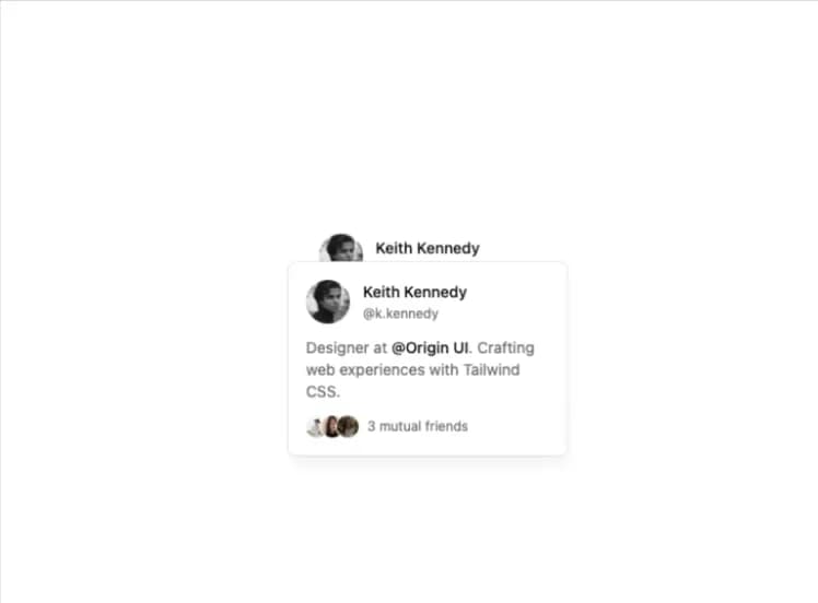
For sighted users to preview content available behind a link.
Built with React and Tailwind. Copy the prompt and paste it into Claude Code, Cursor or Lovable: your agent adds Hover Card to your project and fits it to your theme.
Code
How Hover Card is used: the demo's code. The component's own source comes with a free account.
Usage.tsx
import {
  HoverCard,
  HoverCardContent,
  HoverCardTrigger,
} from "@/components/ui/hover-card";

function HoverCardDemo() {
  return (
    <HoverCard>
      <div className="flex items-center gap-3">
        <img
          className="shrink-0 rounded-full"
          src="https://cdn.21st.dev/assets/localized/2923de7cae4ce08ba2827c770ae363f1abf3666e37efb9362aba0f4dc59532ee.jpg"
          width={40}
          height={40}
          alt="Avatar"
        />
        <div className="space-y-0.5">
          <HoverCardTrigger asChild>
            <a className="text-sm font-medium hover:underline" href="#">
              Keith Kennedy
            </a>
          </HoverCardTrigger>
          <p className="text-xs text-muted-foreground">@k.kennedy</p>
        </div>
      </div>
      <HoverCardContent className="shadow-lg shadow-black/5">
        <div className="space-y-3">
          <div className="flex items-center gap-3">
            <img
              className="shrink-0 rounded-full"
              src="https://cdn.21st.dev/assets/localized/2923de7cae4ce08ba2827c770ae363f1abf3666e37efb9362aba0f4dc59532ee.jpg"
              width={40}
              height={40}
              alt="Avatar"
            />
            <div className="space-y-0.5">
              <p className="text-sm font-medium">Keith Kennedy</p>
              <p className="text-xs text-muted-foreground">@k.kennedy</p>
            </div>
          </div>
          <p className="text-sm text-muted-foreground">
            Designer at{" "}
            <strong className="font-medium text-foreground">@Origin UI</strong>.
            Crafting web experiences with Tailwind CSS.
          </p>
          <div className="flex items-center gap-2">
            <div className="flex -space-x-1.5">
              <img
                className="rounded-full ring-1 ring-background"
                src="https://cdn.21st.dev/assets/localized/c6ba8b85456a494fba3c51412c1ca2d257bfb686be9e3d3c02f88e3453b534fe.jpg"
                width={20}
                height={20}
                alt="Friend 01"
              />
              <img
                className="rounded-full ring-1 ring-background"
                src="https://cdn.21st.dev/assets/localized/c2d3bb036d10180eab29a97d178ac6aa0152cf7f8f749ba7a67c845366918a6d.jpg"
                width={20}
                height={20}
                alt="Friend 02"
              />
              <img
                className="rounded-full ring-1 ring-background"
                src="https://cdn.21st.dev/assets/localized/a1978b00760c26de9d83bacd966f44c9e8156a6526863b159db689362cc4bca7.jpg"
                width={20}
                height={20}
                alt="Friend 03"
              />
            </div>
            <div className="text-xs text-muted-foreground">
              3 mutual friends
            </div>
          </div>
        </div>
      </HoverCardContent>
    </HoverCard>
  );
}

export { HoverCardDemo };

export default HoverCardDemo;
Dependencies
More by shadcn
View all

Navigation menu
771
Calendar with time pressets
504
Sidebar
339
Sonner
231
Chart
216
Icons
178
Dropdown Menu
149
Calendar with event slots
116
More in Cards
View all
Stats cards with links
33

Course Design Cards
1.1K

Card
70
Statistics Card 2
264
Statistics Card 10
263

Card
17

Card Studio
9
The Item one
3
