
About
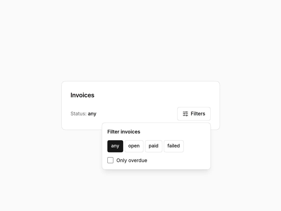
Radix popover for filters and small forms: collision-aware, closes on Escape and outside click, and returns focus to its trigger. Part of the Layro System: layro.vercel.app.
Built with React and Tailwind. Copy the prompt and paste it into Claude Code, Cursor or Lovable: your agent adds Popover to your project and fits it to your theme.
Code
How Popover is used: the demo's code. The component's own source comes with a free account.
Usage.tsx
import * as React from "react";
import { Popover, PopoverContent, PopoverTrigger } from "@/components/ui/layro-popover";
import { SlidersHorizontal } from "lucide-react";

/* A floating panel anchored to its trigger, for filters and small forms.
   It flips when there is no room, closes on Escape and outside click, and
   hands focus back to the button that opened it. */

export default function PopoverDemo() {
  const [status, setStatus] = React.useState("any");
  const [overdue, setOverdue] = React.useState(false);
  return (
    <div className="flex min-h-screen w-full items-center justify-center bg-background p-6">
      <div className="w-full min-w-0 rounded-[18px] [corner-shape:squircle] bg-card p-6 text-card-foreground ring-1 ring-border" style={{ maxWidth: 420 }}>
        <h2 className="text-[16px] font-semibold tracking-[-0.01em]">Invoices</h2>
        <div className="mb-5" />
        <div className="flex items-center justify-between gap-3">
          <p className="text-[13px] text-muted-foreground">Status: <span className="font-medium text-foreground">{status}</span>{overdue ? " · overdue only" : ""}</p>
          <Popover>
            <PopoverTrigger asChild>
              <button type="button" className="inline-flex h-9 items-center gap-1.5 rounded-[10px] [corner-shape:squircle] bg-background px-3.5 text-[13px] font-medium ring-1 ring-inset ring-border outline-none hover:bg-accent focus-visible:ring-2 focus-visible:ring-ring"><SlidersHorizontal className="size-4" /> Filters</button>
            </PopoverTrigger>
            <PopoverContent align="end" aria-label="Filter invoices" className="grid gap-3">
              <p className="text-[13px] font-semibold">Filter invoices</p>
              <div className="flex flex-wrap gap-1" role="group" aria-label="Status">
                {["any", "open", "paid", "failed"].map((s) => (
                  <button key={s} type="button" aria-pressed={status === s} onClick={() => setStatus(s)} className={`h-8 rounded-[8px] [corner-shape:squircle] px-2.5 text-[12.5px] font-medium ring-1 ring-inset outline-none focus-visible:ring-2 focus-visible:ring-ring ${status === s ? "bg-primary text-primary-foreground ring-primary" : "ring-border hover:bg-accent"}`}>{s}</button>
                ))}
              </div>
              <label className="flex items-center gap-2 text-[13px]"><input type="checkbox" checked={overdue} onChange={(e) => setOverdue(e.target.checked)} className="size-4 accent-primary" /> Only overdue</label>
            </PopoverContent>
          </Popover>
        </div>
      </div>
    </div>
  );
}
Dependencies
More by Mohamed Uvaish
View all

Signature Pad
420
Folder Card
336
Share Dialog
308
Kanban Board
249
Notification Panel
102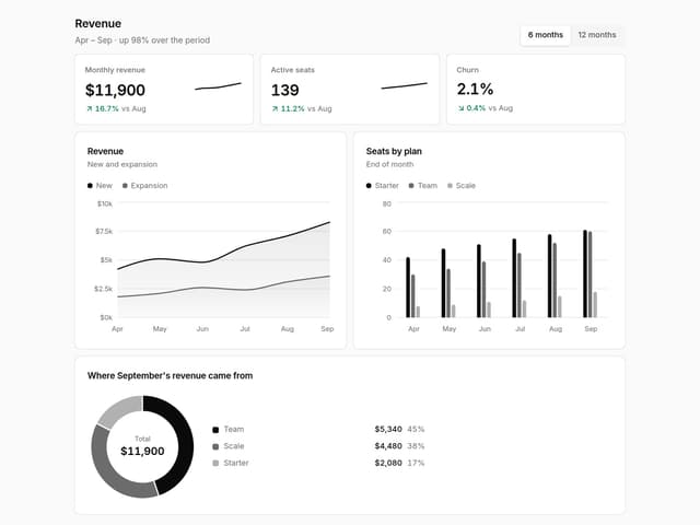
Charts & KPI Cards
87
Rich Text Editor
44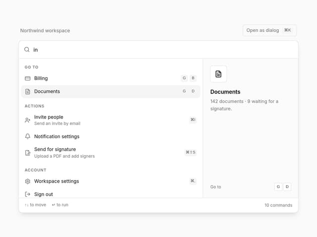
Command Menu
35