
About
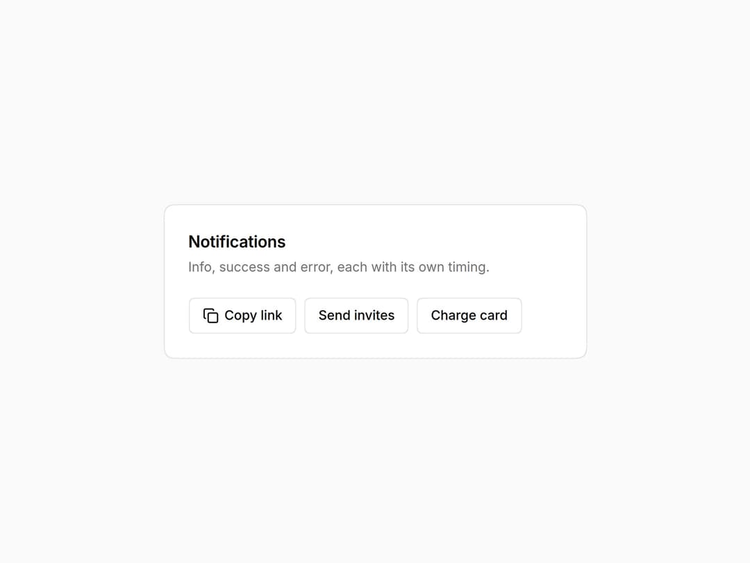
Toasts from anywhere with toast(), toast.success() and toast.error(). Successes time out; errors stay until dismissed. Swipe to dismiss. Part of the Layro System: layro.vercel.app.
Built with React and Tailwind. Copy the prompt and paste it into Claude Code, Cursor or Lovable: your agent adds Toast to your project and fits it to your theme.
Code
How Toast is used: the demo's code. The component's own source comes with a free account.
Usage.tsx
import * as React from "react";
import { Toaster, toast } from "@/components/ui/layro-toast";
import { Copy } from "lucide-react";

/* Call toast() from any handler; one Toaster renders them. Successes
   leave on their own; errors stay until dismissed, because an error that
   disappears before it is read did not happen. */

export default function ToastDemo() {
  return (
    <div className="flex min-h-screen w-full items-center justify-center bg-background p-6">
      <div className="w-full min-w-0 rounded-[18px] [corner-shape:squircle] bg-card p-6 text-card-foreground ring-1 ring-border" style={{ maxWidth: 420 }}>
        <h2 className="text-[16px] font-semibold tracking-[-0.01em]">Notifications</h2>
        <p className="mt-1 mb-5 text-[13px] text-muted-foreground">Info, success and error, each with its own timing.</p>
        <div className="flex flex-wrap gap-2">
          <button type="button" className="inline-flex h-9 items-center gap-1.5 rounded-[10px] [corner-shape:squircle] bg-background px-3.5 text-[13px] font-medium ring-1 ring-inset ring-border outline-none hover:bg-accent focus-visible:ring-2 focus-visible:ring-ring" onClick={() => toast("Link copied", { description: "Anyone at Northwind can view." })}><Copy className="size-4" /> Copy link</button>
          <button type="button" className="inline-flex h-9 items-center gap-1.5 rounded-[10px] [corner-shape:squircle] bg-background px-3.5 text-[13px] font-medium ring-1 ring-inset ring-border outline-none hover:bg-accent focus-visible:ring-2 focus-visible:ring-ring" onClick={() => toast.success("Invites sent", { description: "4 people will get an email." })}>Send invites</button>
          <button type="button" className="inline-flex h-9 items-center gap-1.5 rounded-[10px] [corner-shape:squircle] bg-background px-3.5 text-[13px] font-medium ring-1 ring-inset ring-border outline-none hover:bg-accent focus-visible:ring-2 focus-visible:ring-ring" onClick={() => toast.error("Card declined", { description: "Visa ending 2119. Nothing was charged." })}>Charge card</button>
        </div>
        <Toaster />
      </div>
    </div>
  );
}
Dependencies
More by Mohamed Uvaish
View all

Signature Pad
420
Folder Card
336
Share Dialog
308
Kanban Board
249
Notification Panel
102
Charts & KPI Cards
86
Rich Text Editor
44
Command Menu
34