
About
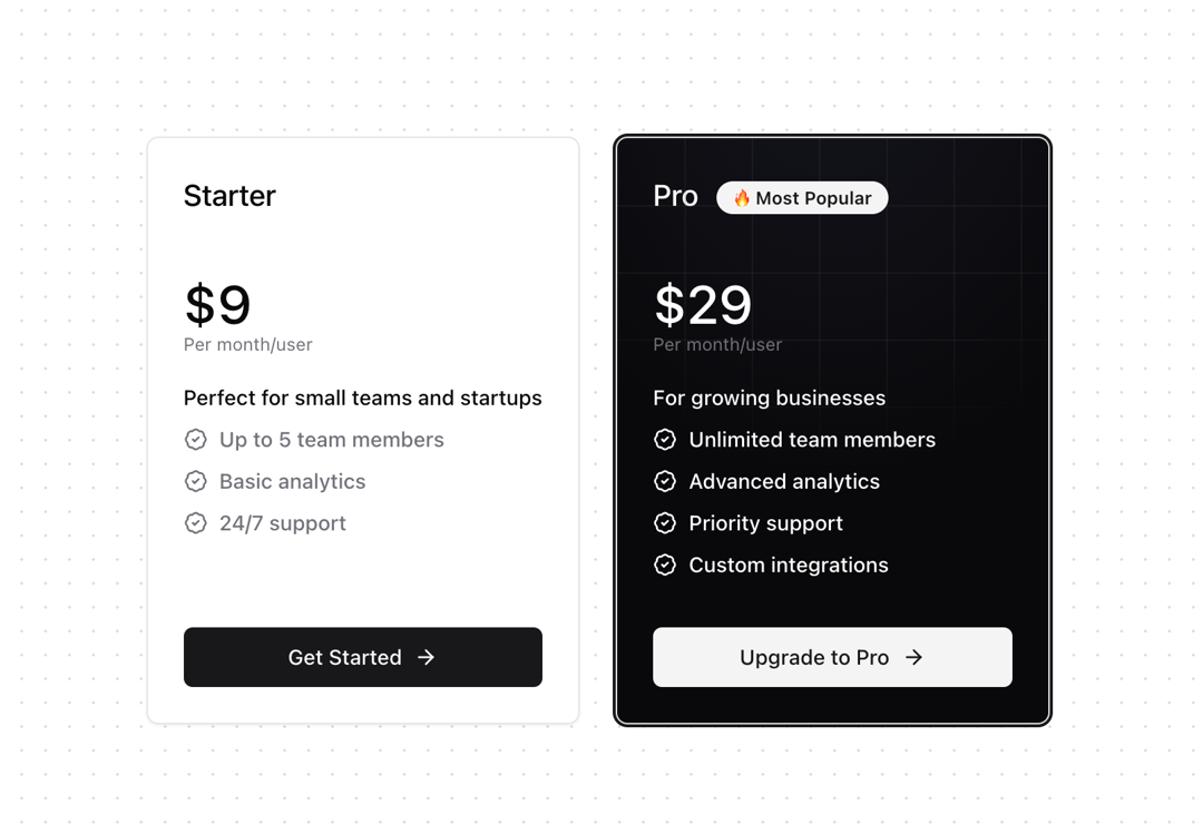
A customizable pricing tier card component with support for highlighted and popular states. Originally built for Dub.co's pricing page. Features - Monthly/yearly pricing toggle support - Highlighted tier styling with grid background - Popular tier styling with gradient effect - Animated number transitions - Dark mode support - Responsive design
Built with React and Tailwind. Copy the prompt and paste it into Claude Code, Cursor or Lovable: your agent adds Pricing Card to your project and fits it to your theme.
Code
How Pricing Card is used: the demo's code. The component's own source comes with a free account.
Usage.tsx
import { PricingCard } from "@/components/ui/pricing-card";

const DEMO_TIERS = [
  {
    name: "Starter",
    price: {
      monthly: 9,
      yearly: 90,
    },
    description: "Perfect for small teams and startups",
    features: ["Up to 5 team members", "Basic analytics", "24/7 support"],
    cta: "Get Started",
  },
  {
    name: "Pro",
    price: {
      monthly: 29,
      yearly: 290,
    },
    description: "For growing businesses",
    features: [
      "Unlimited team members",
      "Advanced analytics",
      "Priority support",
      "Custom integrations",
    ],
    cta: "Upgrade to Pro",
    highlighted: true,
    popular: true,
  },
];

export function PricingCardDemo() {
  return (
    <div className="grid gap-6 p-6 md:grid-cols-2">
      {DEMO_TIERS.map((tier) => (
        <PricingCard key={tier.name} tier={tier} paymentFrequency="monthly" />
      ))}
    </div>
  );
}
Dependencies
More by Ayman Echakar
View all
Pricing Section
1.6K
User Dropdown
910
Blog Posts
363
Pricing Tab
192
Toast
Authentication Modal
More in Pricing
View all
Pricing Section
582

Pricing Cards
31

Pricing Card
535

Pricing Section
173
pricing section
158
Single Pricing Card
795

Pricing
125
Glowing Pricing Tiers
45


