
About
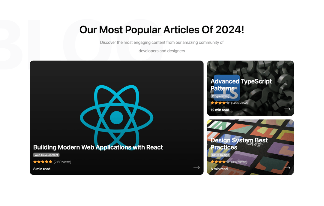
A responsive and adaptive grid layout component designed for displaying blog posts or articles in an elegant card format. Features a hero-style layout with one large primary card and smaller secondary cards. This component is highly flexible and can be adapted to display any type of data or cards beyond blog posts.
Built with React and Tailwind. Copy the prompt and paste it into Claude Code, Cursor or Lovable: your agent adds Blog Posts to your project and fits it to your theme.
Code
How Blog Posts is used: the demo's code. The component's own source comes with a free account.
Usage.tsx
import { Component } from "@/components/ui/blog-posts";

export default function DemoOne() {
  return (
    <Component
        title="Our Most Popular Articles of 2024!"
        description="Discover the most engaging content from our amazing community of developers and designers"
        backgroundLabel="BLOG"
        backgroundPosition="left"
        posts={[
        {
          id: 1,
          title: "Building Modern Web Applications with React",
          category: "Web Development",
          imageUrl: "https://cdn.21st.dev/assets/mirror/e0/e063c1a8c8232e296b086583dbb2b724b236c4ca4d26bc7ac2639e90591349a1.jpg",
          views: 2180,
          readTime: 8,
          rating: 5
        },
        {
          id: 2,
          title: "Advanced TypeScript Patterns",
          category: "Programming",
          imageUrl: "https://cdn.21st.dev/assets/mirror/c6/c6b2d27ae0e09d07a3b4c3c495a500c7ca6e42a42474c99fcac162570c451448.jpg",
          views: 1456,
          readTime: 12,
          rating: 4
        },
        {
          id: 3,
          title: "Design System Best Practices",
          category: "UI/UX Design",
          imageUrl: "https://cdn.21st.dev/assets/mirror/d5/d5bc472b5828dc1386d53ee0ffe616bce65e6dcf9a31d5ab53b0d2d61bbd7a14.jpg",
          views: 987,
          readTime: 6,
          rating: 4
        }
      ]}
        className="mb-16"
      />
  )
}
Dependencies
More by Ayman Echakar
View all
Pricing Section
1.6K
User Dropdown
910
Pricing Tab
192
Pricing Card
8
Toast
Authentication Modal
More in Cards
View all
Stats cards with links
33

Course Design Cards
1.1K

Card
70
Statistics Card 2
264
Statistics Card 10
263

Card
17

Card Studio
9
The Item one
3
