
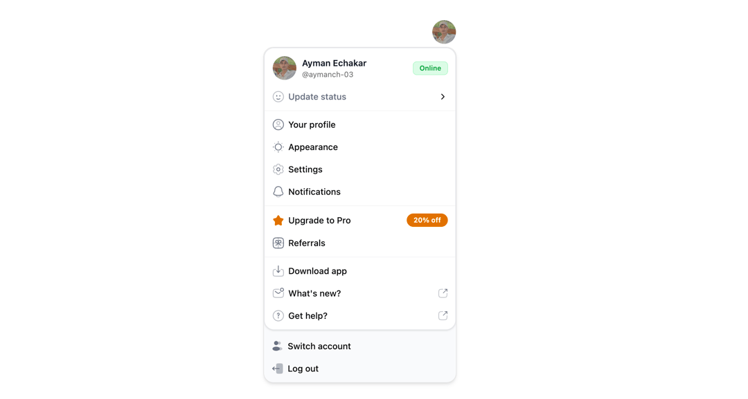
A comprehensive user profile dropdown menu with avatar trigger, status management, and organized navigation sections. Features dark/light mode support, customizable user data, and grouped menu items for profile settings, premium features, support resources, and account management. Built with React, Tailwind CSS, and Iconify icons. Key Features: Avatar-triggered dropdown with user info display Status indicator with update submenu (Online, Focus, Offline) Organized menu sections (Profile, Premium, Support, Account) Full dark/light theme compatibility Configurable props for user data and event handlers Modern UI with icons, badges, and responsive design Perfect for SaaS platforms, dashboards, and applications requiring professional user account management interfaces.
Built with React and Tailwind. Copy the prompt and paste it into Claude Code, Cursor or Lovable: your agent adds User Dropdown to your project and fits it to your theme.
Code
How User Dropdown is used: the demo's code. The component's own source comes with a free account.
Usage.tsx
import { UserDropdown } from "@/components/ui/user-dropdown";

export default function DemoOne() {
  return <UserDropdown />;
}
Dependencies
More by Ayman Echakar
View all
Pricing Section
1.6K
Blog Posts
363
Pricing Tab
192
Pricing Card
8
Toast
Authentication Modal