
About
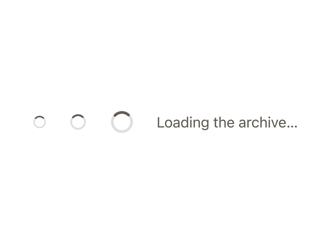
A small circular loading indicator (ring with a rotating arc) used to show that content or an action is still in progress.
Built with React and Tailwind. Copy the prompt and paste it into Claude Code, Cursor or Lovable: your agent adds Spinner to your project and fits it to your theme.
Code
How Spinner is used: the demo's code. The component's own source comes with a free account.
Usage.tsx
"use client";

import Spinner from "@/components/ui/spinner";

import { useEffect } from "react";
import "@bysages/tokens/css";
import { applyTheme } from "@bysages/core";

export default function SpinnerSizesDemo() {
  useEffect(() => {
    applyTheme({ mode: "light" });
  }, []);

  return (
    <div
      style={{
        display: "flex",
        alignItems: "center",
        gap: "var(--bs-space-6)",
      }}
    >
      <Spinner size="sm" />
      <Spinner size="md" />
      <Spinner size="lg" />
      <span style={{ color: "var(--bs-color-text-tertiary)" }}>
        Loading the archive…
      </span>
    </div>
  );
}
Dependencies
More by bysages
View all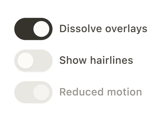
Switch
13
Avatar Group
5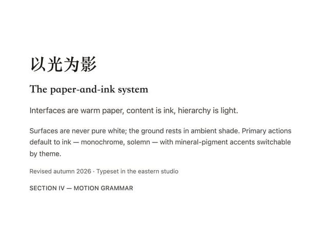
Typography
4
Grid
Float Button
Timeline

Floating Panel
Ellipsis