
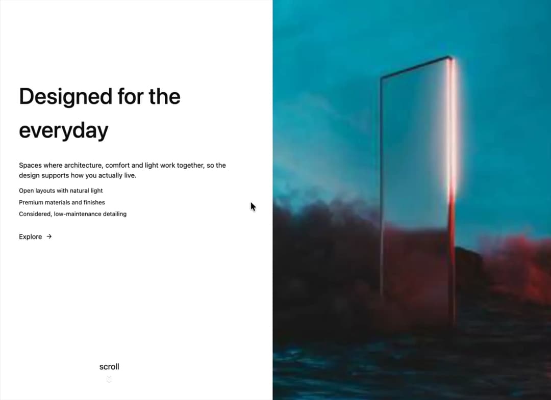
About
Split-screen sticky scroll: content on one side steps through headings, copy and a CTA while the paired image scales and swaps on the other. Theme-aware, snap-aware, mobile stack fallback, prop-driven.
Built with React and Tailwind. Copy the prompt and paste it into Claude Code, Cursor or Lovable: your agent adds Sticky Content Wrapper to your project and fits it to your theme.
Code
How Sticky Content Wrapper is used: the demo's code. The component's own source comes with a free account.
Usage.tsx
"use client";

import StickyContentWrapper from "@/components/ui/sticky-content-wrapper";

// Paints the theme background out of the box. Pass `items` for your own content.
export default function StickyContentWrapperDemo() {
  return <StickyContentWrapper />;
}
Dependencies
More by Hyperiux Vault
View all

Product Timeline
2.3K
Stack Spread
1.3K
Arrow Fill Button
912
Interactive List Preview
869
Shiny Button
750
Circular Split Roll
641
Zoom Slider
430
Stack Loader
371