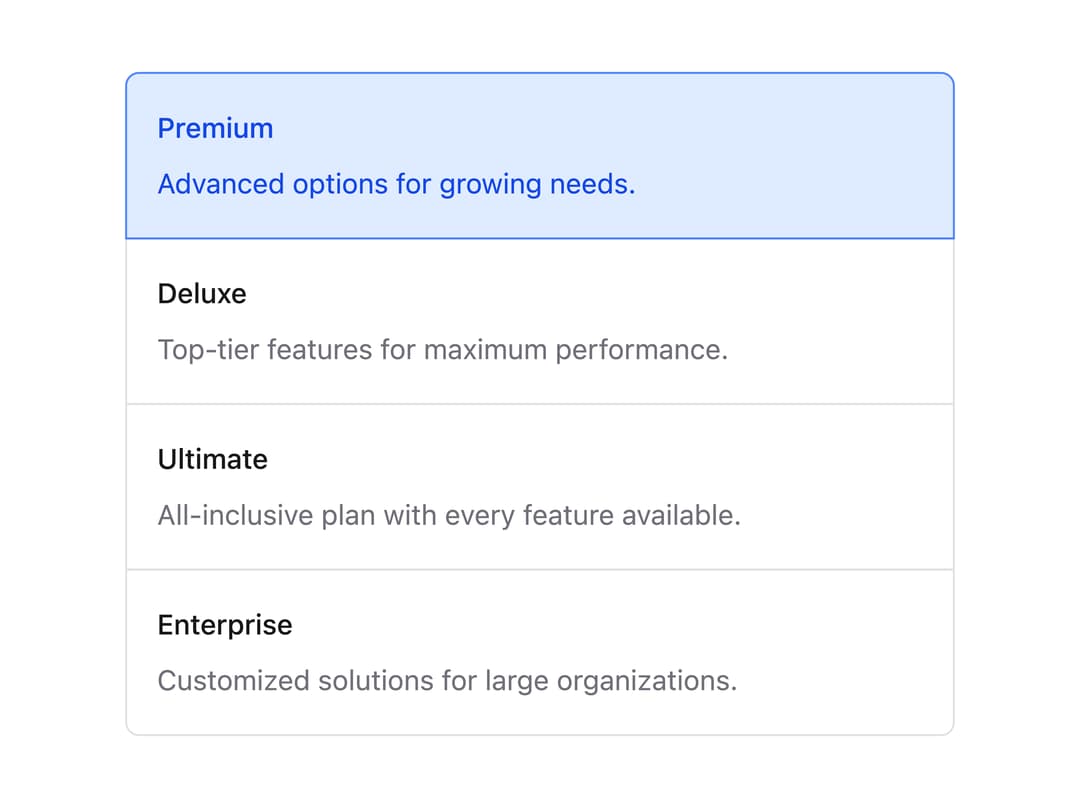
About
A larger, more descriptive selectable card group (single or multiple selection) built on React Aria GridList, with room for a label and supporting description on each option.
Built with React and Tailwind. Copy the prompt and paste it into Claude Code, Cursor or Lovable: your agent adds Choice Box to your project and fits it to your theme.
Code
How Choice Box is used: the demo's code. The component's own source comes with a free account.
Usage.tsx
"use client";

import {
  ChoiceBox,
  ChoiceBoxDescription,
  ChoiceBoxItem,
  ChoiceBoxLabel,
} from "@/components/ui/choice-box";

export default function ChoiceBoxDemo() {
  return (
    <div className="mx-auto w-full max-w-md p-4">
      <ChoiceBox
        aria-label="Select a plan"
        selectionMode="single"
        defaultSelectedKeys={["premium"]}
      >
        <ChoiceBoxItem id="premium" textValue="Premium">
          <ChoiceBoxLabel>Premium</ChoiceBoxLabel>
          <ChoiceBoxDescription>
            Advanced options for growing needs.
          </ChoiceBoxDescription>
        </ChoiceBoxItem>
        <ChoiceBoxItem id="deluxe" textValue="Deluxe">
          <ChoiceBoxLabel>Deluxe</ChoiceBoxLabel>
          <ChoiceBoxDescription>
            Top-tier features for maximum performance.
          </ChoiceBoxDescription>
        </ChoiceBoxItem>
        <ChoiceBoxItem id="ultimate" textValue="Ultimate">
          <ChoiceBoxLabel>Ultimate</ChoiceBoxLabel>
          <ChoiceBoxDescription>
            All-inclusive plan with every feature available.
          </ChoiceBoxDescription>
        </ChoiceBoxItem>
        <ChoiceBoxItem id="enterprise" textValue="Enterprise">
          <ChoiceBoxLabel>Enterprise</ChoiceBoxLabel>
          <ChoiceBoxDescription>
            Customized solutions for large organizations.
          </ChoiceBoxDescription>
        </ChoiceBoxItem>
      </ChoiceBox>
    </div>
  );
}
Dependencies
More by Intent UI
View all

Radar Chart
217
Radial Chart
77
Bar Chart
44
Pie Chart
29
Toggle Group
25
Loader
23
Progress Bar
19
Color Slider
13
More in Pricing
View all
Pricing Section
576

Pricing Section
173

Pricing Card
363

Pricing Cards
85
Glowing Pricing Tiers
40
Single Pricing Card
793
pricing section
157
Colorful-Pricing
84


