About
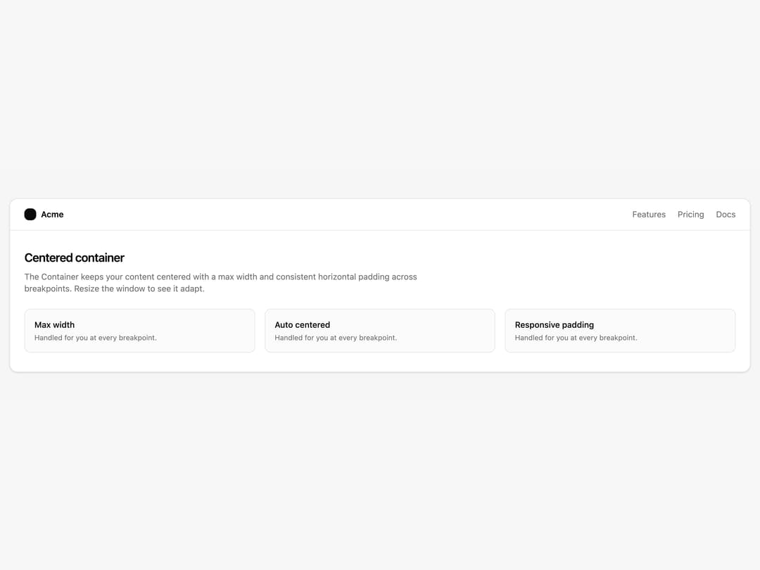
A responsive layout wrapper that centers content with a max width and consistent horizontal padding, with constrained or full-width options.
Built with React and Tailwind. Copy the prompt and paste it into Claude Code, Cursor or Lovable: your agent adds Container to your project and fits it to your theme.
Code
How Container is used: the demo's code. The component's own source comes with a free account.
Usage.tsx
import { Container } from "@/components/ui/container";

export default function ContainerDemo() {
  return (
    <div className="w-full bg-muted/50 py-12">
      {/* full-bleed band so the Container's centered max-width + padding is visible */}
      <Container>
        <div className="rounded-xl border bg-background shadow-sm">
          <div className="flex items-center justify-between border-b px-6 py-4">
            <div className="flex items-center gap-2">
              <div className="size-5 rounded-md bg-foreground" />
              <span className="text-sm font-semibold text-foreground">
                Acme
              </span>
            </div>
            <nav className="hidden items-center gap-5 text-sm text-muted-foreground sm:flex">
              <span>Features</span>
              <span>Pricing</span>
              <span>Docs</span>
            </nav>
          </div>

          <div className="px-6 py-8">
            <h2 className="text-xl font-semibold tracking-tight text-foreground">
              Centered container
            </h2>
            <p className="mt-2 max-w-2xl text-sm text-muted-foreground">
              The Container keeps your content centered with a max width and
              consistent horizontal padding across breakpoints. Resize the
              window to see it adapt.
            </p>

            <div className="mt-6 grid gap-4 sm:grid-cols-3">
              {["Max width", "Auto centered", "Responsive padding"].map(
                (title) => (
                  <div
                    key={title}
                    className="rounded-lg border bg-muted/40 p-4"
                  >
                    <div className="text-sm font-medium text-foreground">
                      {title}
                    </div>
                    <div className="mt-1 text-xs text-muted-foreground">
                      Handled for you at every breakpoint.
                    </div>
                  </div>
                ),
              )}
            </div>
          </div>
        </div>
      </Container>
    </div>
  );
}
Dependencies
More by Intent UI
View all

Radar Chart
217
Radial Chart
77
Bar Chart
44
Pie Chart
31
Toggle Group
26
Loader
23
Progress Bar
19
Color Slider
13
More in Cards
View all
Stats cards with links
33

Course Design Cards
1.1K

Card
70
Statistics Card 2
264
Statistics Card 10
263

Card
17

Card Studio
9
The Item one
3
