
About
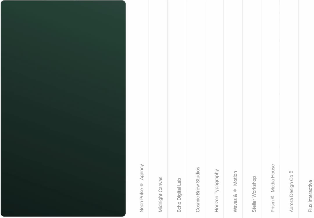
Hover expand image gallery accordion: a row of hairline-separated panels with vertical labels, where the hovered or tapped panel grows to reveal its image while the rest stay rail-width. Below 1024px it becomes a vertical accordion. For portfolios and case studies. Pure CSS, no animation library.
Built with React and Tailwind. Copy the prompt and paste it into Claude Code, Cursor or Lovable: your agent adds Hover Expand Gallery to your project and fits it to your theme.
Code
How Hover Expand Gallery is used: the demo's code. The component's own source comes with a free account.
Usage.tsx
"use client"

import HoverExpandGallery from "@/components/ui/hover-expand-gallery"

const settings = {
  railWidth: 64,
  maxOpenWidth: 520,
  duration: 620,
}

export default function Demo(props: Partial<typeof settings>) {
  const s = { ...settings, ...props }
  return (
    <HoverExpandGallery
      railWidth={s.railWidth}
      maxOpenWidth={s.maxOpenWidth}
      duration={s.duration}
    />
  )
}
More by Kedhareswer Naidu
View all

Glassmorphism Folder Cards
2.6K
GitHub Contribution Graph 3D Heatmap
1.8K
Morph Gallery
1.4K
Halftone Wordmark Footer
1.2K
Hanging Polaroid Image Carousel
716
Glass Cards
716
Particle Animation
645
Tiger Tear Reveal
638
More in Galleries
View all
Thumbnail image viewer
43

Animated Gallery
1.4K

Hero Section 6
881
Editorial Collage Hero
430
Layout Grid
826
3D Parallax Unfurling Gallery
981

Image Gallery
90

File Upload
18


