
About
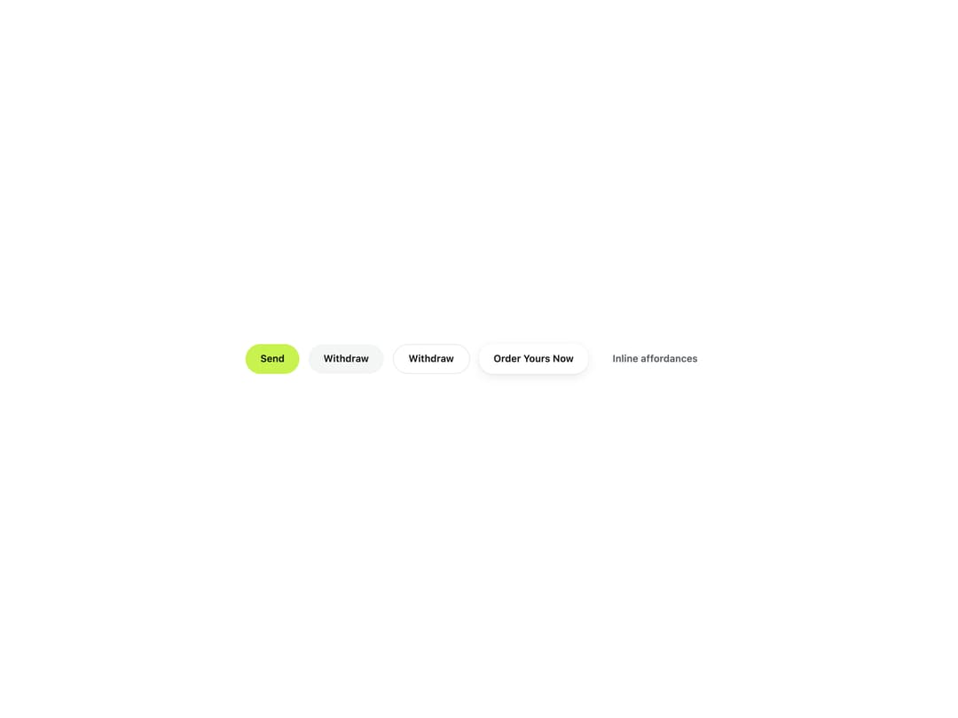
A pill-shaped button with five emphasis variants (accent, muted, outline, white, ghost) that can render as a native button or any element like a link, and swaps its label for a spinner while loading.
Built with React and Tailwind. Copy the prompt and paste it into Claude Code, Cursor or Lovable: your agent adds Accent Button to your project and fits it to your theme.
Code
How Accent Button is used: the demo's code. The component's own source comes with a free account.
Usage.tsx
import { Button } from "@/components/ui/button";

export default function ButtonDemo() {
  return (
    <div className="flex min-h-[280px] w-full flex-wrap items-center justify-center gap-3 bg-surface p-10 text-ink">
      <Button variant="accent">Send</Button>
      <Button variant="muted">Withdraw</Button>
      <Button variant="outline">Withdraw</Button>
      <Button variant="white">Order Yours Now</Button>
      <Button variant="ghost">Inline affordances</Button>
    </div>
  );
}
More by klyv-ui
View all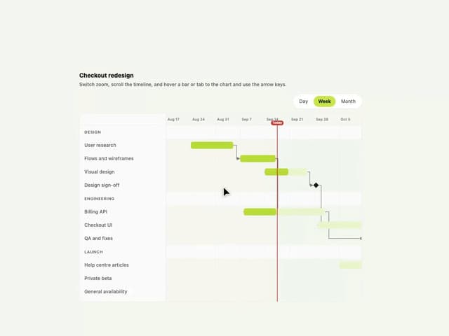
Gantt Chart
56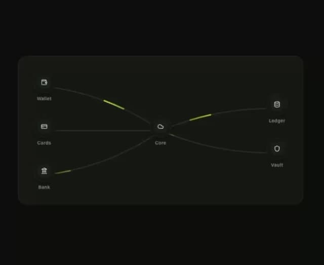
Klyv Animated Beam
47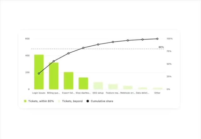
Pareto Chart
40
Shader Canvas
35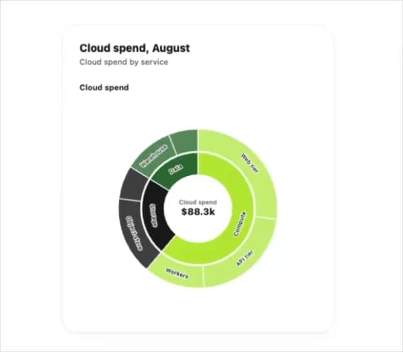
Sunburst Chart
23
Morphing Text
21
Gooey Loader
20
Gravity Tags
17
More in Buttons
View all
Button Save
46

Button
20

Eclipse Button
5

Button
6

Button
14

Button Group
37

Button
32
Split Button
32

