
About
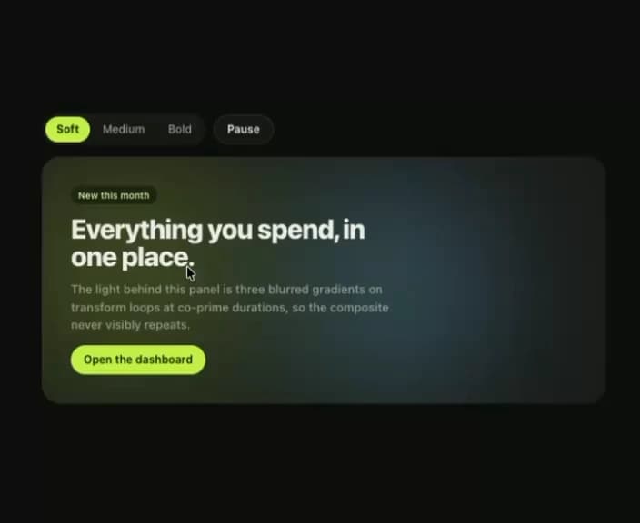
Three drifting colour fields behind a container. Only transform animates, so a full-bleed hero holds 60fps where an animated filter would not.
Built with React and Tailwind. Copy the prompt and paste it into Claude Code, Cursor or Lovable: your agent adds Klyv Aurora Surface to your project and fits it to your theme.
Code
How Klyv Aurora Surface is used: the demo's code. The component's own source comes with a free account.
Usage.tsx
import { useState } from "react";
import { AuroraSurface } from "@/components/ui/klyv-aurora-surface";
import { Button } from "@/components/ui/klyv-aurora-surface-utils/components-Button-Button";
import { SegmentedControl } from "@/components/ui/klyv-aurora-surface-utils/components-SegmentedControl-SegmentedControl";
import { Tag } from "@/components/ui/klyv-aurora-surface-utils/components-Tag-Tag";
import { Text } from "@/components/ui/klyv-aurora-surface-utils/components-Text-Text";
import { type AuroraIntensity } from "@/components/ui/klyv-aurora-surface";

function AuroraExample() {
  const [intensity, setIntensity] = useState<AuroraIntensity>('medium')
  const [paused, setPaused] = useState(false)

  return (
    <div className="flex w-full flex-col gap-3">
      <div className="flex flex-wrap items-center gap-2">
        <SegmentedControl
          label="Intensity"
          size="sm"
          value={intensity}
          onValueChange={(value) => setIntensity(value as AuroraIntensity)}
          options={[
            { value: 'soft', label: 'Soft' },
            { value: 'medium', label: 'Medium' },
            { value: 'bold', label: 'Bold' },
          ]}
        />
        <Button size="sm" variant="outline" onClick={() => setPaused((value) => !value)}>
          {paused ? 'Play' : 'Pause'}
        </Button>
      </div>

      <AuroraSurface
        intensity={intensity}
        paused={paused}
        grain
        className="min-h-[240px]"
        contentClassName="flex flex-col items-start gap-3 p-8"
      >
        <Tag size="sm" tone="accent">
          New this month
        </Tag>
        <Text as="h3" size="display" className="max-w-[18ch]">
          Everything you spend, in one place.
        </Text>
        <Text size="body" weight="medium" tone="soft" leading="normal" className="max-w-[46ch]">
          The light behind this panel is three blurred gradients on transform loops at co-prime
          durations, so the composite never visibly repeats.
        </Text>
        <Button size="sm">Open the dashboard</Button>
      </AuroraSurface>
    </div>
  )
}

export default function Demo(){return <div data-component-demo className="flex min-h-screen w-full items-center justify-center bg-canvas p-8 text-ink"><div className="w-full max-w-[620px]"><AuroraExample /></div></div>}
More by klyv-ui
View all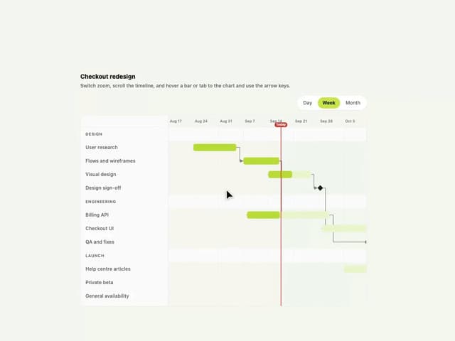
Gantt Chart
51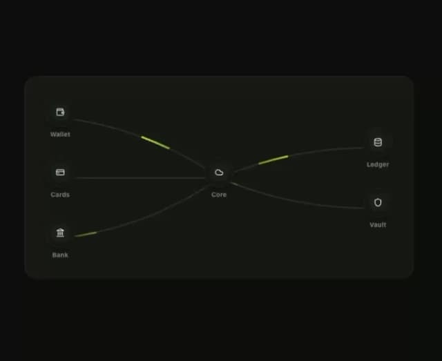
Klyv Animated Beam
41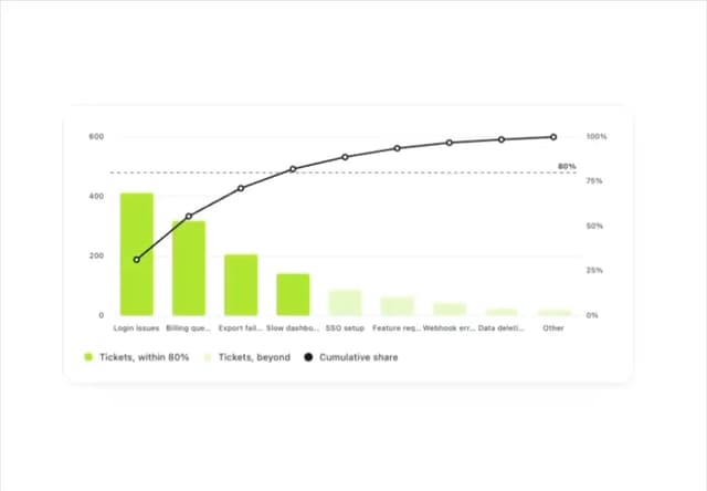
Pareto Chart
37
Shader Canvas
33
Sunburst Chart
21
Morphing Text
20
Gravity Tags
17
Gooey Loader
14