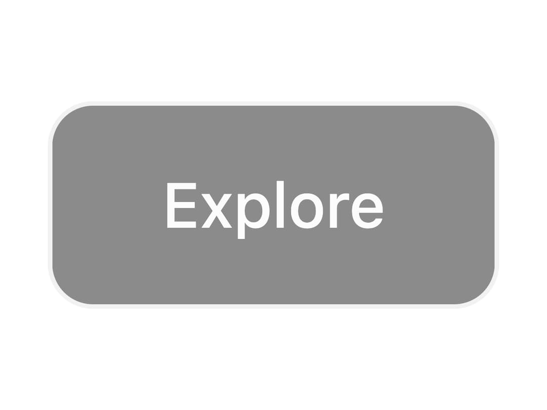
About
A button whose fill sweeps away on hover using an animated sprite-sheet CSS mask, revealing the label underneath like a flipbook wipe transition.
Built with React and Tailwind. Copy the prompt and paste it into Claude Code, Cursor or Lovable: your agent adds Mask Button to your project and fits it to your theme.
Code
How Mask Button is used: the demo's code. The component's own source comes with a free account.
Usage.tsx
import { MaskButton } from "@/components/ui/mask-button";

export default function MaskButtonDisabledDemo() {
  return <MaskButton disabled>Explore</MaskButton>;
}
More by lucasbassetti
View all

Multi Button
19
Magic Button
8
Animated Tooltip
6
Progress Fold Button
3
Bento Grid
More in Buttons
View all

Button
14
Button
34
Texture Button
92
Button Save
46

Button
64

Button Group
3

App Store Button
454

Notification Button
103

