About
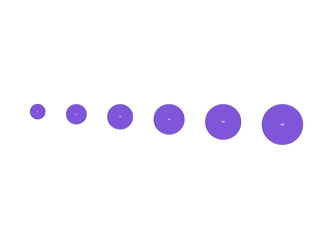
A user avatar image that gracefully falls back to initials or an icon when the photo is missing, with optional online-status dot, verified badge, company-logo badge, and grouped/stacked or profile-photo variants.
Built with React and Tailwind. Copy the prompt and paste it into Claude Code, Cursor or Lovable: your agent adds Avatar to your project and fits it to your theme.
Code
How Avatar is used: the demo's code. The component's own source comes with a free account.
Usage.tsx
import Avatar from "@/components/ui/avatar";

export default function AvatarDemo() {
  const src =
    "https://cdn.21st.dev/assets/localized/aef1dddf3f0a7db7576b169903741465d2f7afebd0666243376970fa95f6e00a.svg";
  const alt = "Olivia Rhye";
  return (
    <div className="grid grid-cols-1 gap-8 md:grid-cols-[repeat(6,max-content)]">
      <Avatar size="xs" src={src} alt={alt} />
      <Avatar size="sm" src={src} alt={alt} />
      <Avatar size="md" src={src} alt={alt} />
      <Avatar size="lg" src={src} alt={alt} />
      <Avatar size="xl" src={src} alt={alt} />
      <Avatar size="2xl" src={src} alt={alt} />
    </div>
  );
}
Dependencies
More by properui
View all

Command Menu
13
Loading Indicator
7
Breadcrumbs
Toggle
Tags
Progress Indicators

Radio Buttons
Button