About
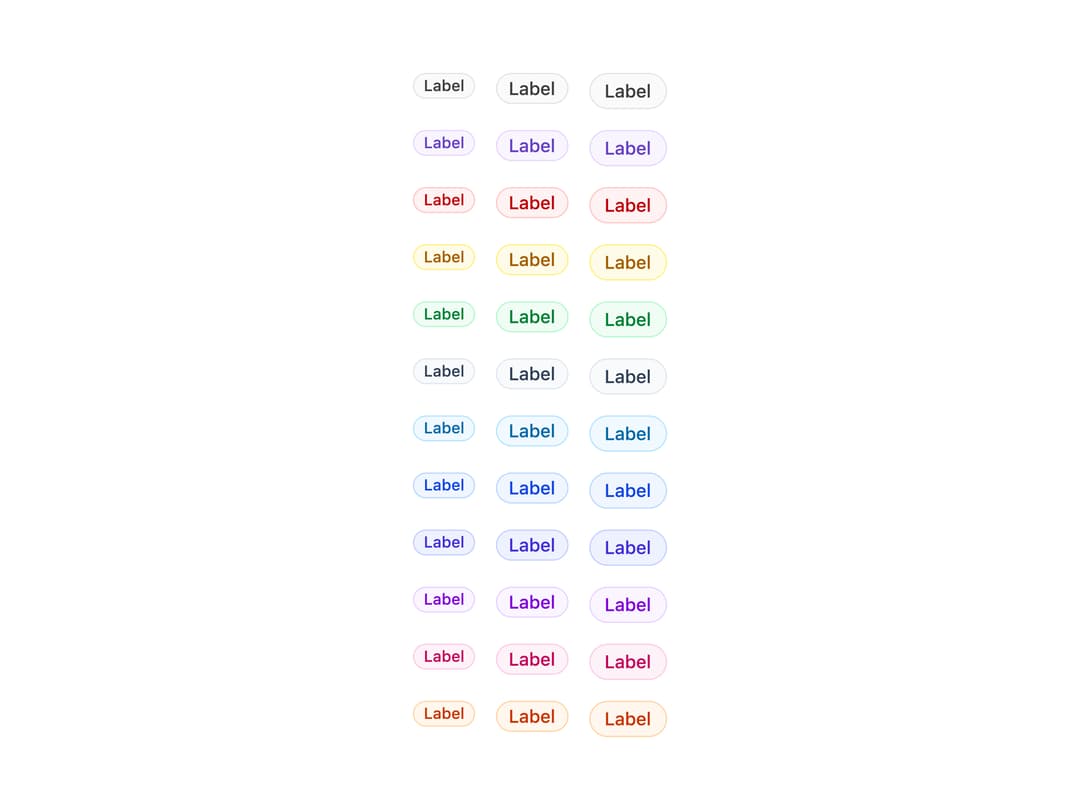
A small colored label used to show a status, category, count, or tag next to content, with pill/rectangle/modern styles and optional dot, icon, flag, avatar, or close button.
Built with React and Tailwind. Copy the prompt and paste it into Claude Code, Cursor or Lovable: your agent adds Badge to your project and fits it to your theme.
Code
How Badge is used: the demo's code. The component's own source comes with a free account.
Usage.tsx
import { Badge, filledColors } from "@/components/ui/badges";

export default function BadgeDefaultDemo() {
  return (
    <div className="flex flex-col items-start gap-4">
      {(Object.keys(filledColors) as Array<keyof typeof filledColors>).map(
        (color) => (
          <div key={color} className="flex items-start gap-4">
            <Badge color={color} size="sm" type="pill-color">
              Label
            </Badge>
            <Badge color={color} size="md" type="pill-color">
              Label
            </Badge>
            <Badge color={color} size="lg" type="pill-color">
              Label
            </Badge>
          </div>
        ),
      )}
    </div>
  );
}
Dependencies
More by properui
View all

Command Menu
13
Loading Indicator
7
Breadcrumbs
Toggle
Tags
Progress Indicators
Radio Buttons
Button