About
A form wrapper built on React Aria that groups fields into a single submit/validation boundary, with an optional variant that binds to a react-hook-form instance.
Built with React and Tailwind. Copy the prompt and paste it into Claude Code, Cursor or Lovable: your agent adds Form to your project and fits it to your theme.
Code
How Form is used: the demo's code. The component's own source comes with a free account.
Usage.tsx
"use client";

import Form from "@/components/ui/form";
import {
  Button,
  FieldError,
  Input,
  Label,
  TextField,
} from "react-aria-components";

export default function FormDemo() {
  return (
    <div className="flex min-h-screen w-full items-center justify-center bg-[var(--background)] p-8 text-[var(--foreground)]">
      <Form
        className="flex w-full max-w-sm flex-col gap-5 rounded-xl border border-[var(--border)] bg-[var(--background)] p-6"
        onSubmit={(e) => e.preventDefault()}
      >
        <div className="flex flex-col gap-1">
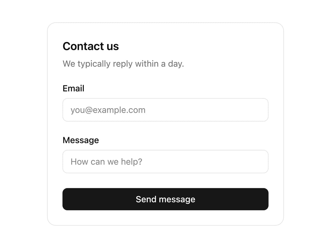
          <h2 className="text-lg font-semibold">Contact us</h2>
          <p className="text-sm text-muted-foreground">
            We typically reply within a day.
          </p>
        </div>

        <TextField
          name="email"
          type="email"
          isRequired
          className="flex flex-col gap-1.5"
        >
          <Label className="text-sm font-medium">Email</Label>
          <Input
            placeholder="you@example.com"
            className="rounded-md border border-[var(--border)] bg-transparent px-3 py-2 text-sm outline-none focus:ring-2 focus:ring-[var(--ring)]"
          />
          <FieldError className="text-sm text-red-500" />
        </TextField>

        <TextField
          name="message"
          isRequired
          minLength={10}
          className="flex flex-col gap-1.5"
        >
          <Label className="text-sm font-medium">Message</Label>
          <Input
            placeholder="How can we help?"
            className="rounded-md border border-[var(--border)] bg-transparent px-3 py-2 text-sm outline-none focus:ring-2 focus:ring-[var(--ring)]"
          />
          <FieldError className="text-sm text-red-500" />
        </TextField>

        <Button
          type="submit"
          className="mt-1 rounded-md bg-[var(--primary)] px-4 py-2 text-sm font-medium text-[var(--primary-foreground)]"
        >
          Send message
        </Button>
      </Form>
    </div>
  );
}
Dependencies
More by properui
View all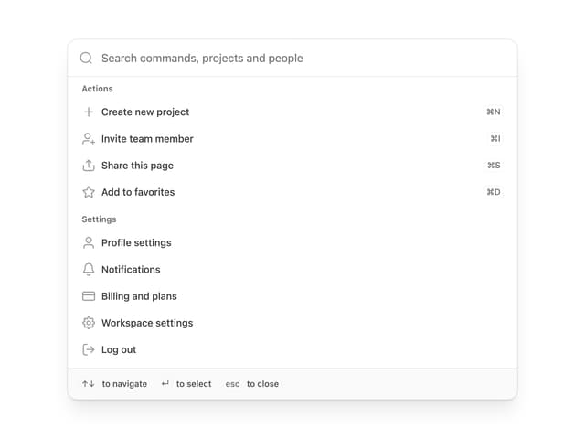

Command Menu
13
Loading Indicator
7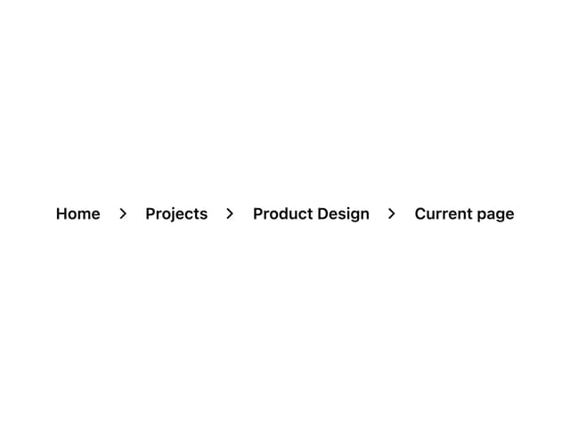
Breadcrumbs
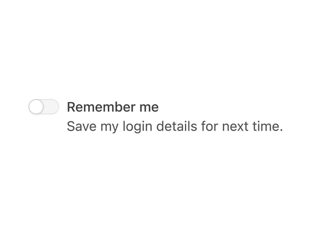
Toggle
Tags
Progress Indicators
Radio Buttons
Button
More in Forms
View all

Premium Auth
500

Login 1
52

Book A Demo 3
83
Authentication Card
47
Book A Demo 1
69

Contact Card
1K

Login Card
32

Login 2
7
