
About
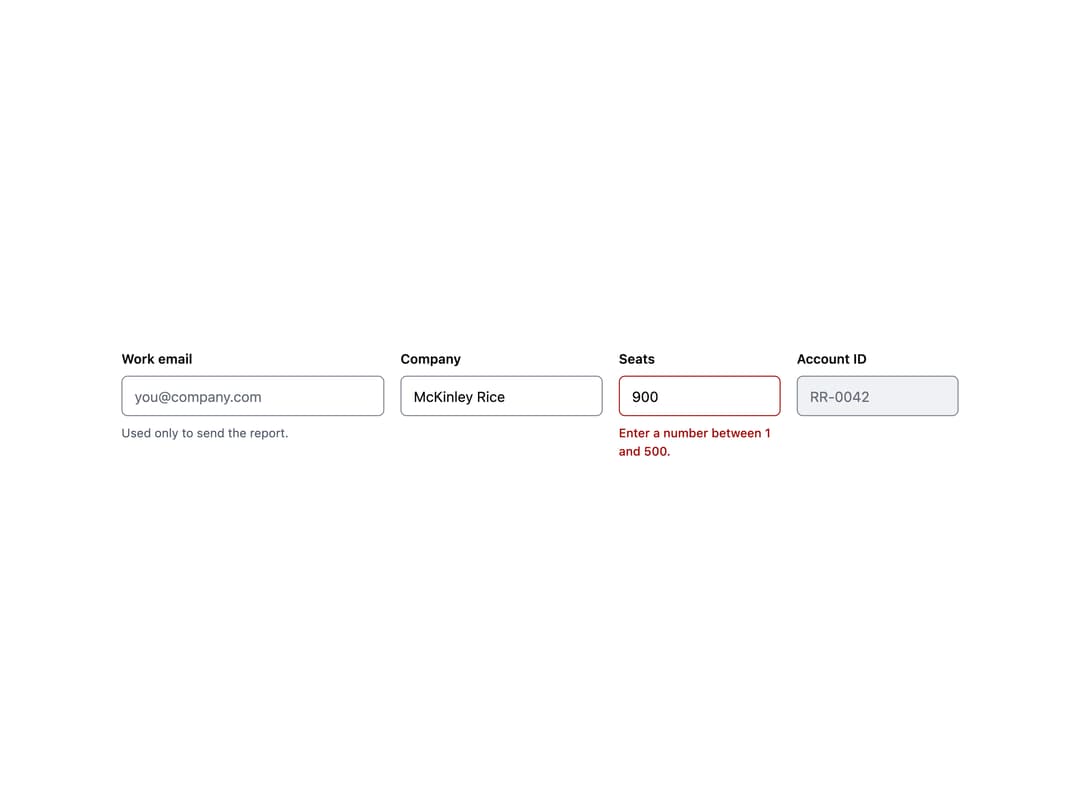
A labeled single-line text field with hint and error messaging, built for accessible forms.
Built with React and Tailwind. Copy the prompt and paste it into Claude Code, Cursor or Lovable: your agent adds Input to your project and fits it to your theme.
Code
How Input is used: the demo's code. The component's own source comes with a free account.
Usage.tsx
import Input from "@/components/ui/rr-input";

export default function InputDemo() {
  return (
    <div
      style={{
        display: "flex",
        gap: "16px",
        alignItems: "flex-start",
        flexWrap: "wrap",
        padding: "24px",
        background: "var(--surface-base, #fff)",
      }}
    >
      <Input
        label="Work email"
        placeholder="you@company.com"
        hint="Used only to send the report."
        style={{ width: "260px" }}
      />
      <Input
        label="Company"
        defaultValue="McKinley Rice"
        style={{ width: "200px" }}
      />
      <Input
        label="Seats"
        error="Enter a number between 1 and 500."
        defaultValue="900"
        style={{ width: "160px" }}
      />
      <Input
        label="Account ID"
        disabled
        defaultValue="RR-0042"
        style={{ width: "160px" }}
      />
    </div>
  );
}
More by redrob-labs
View all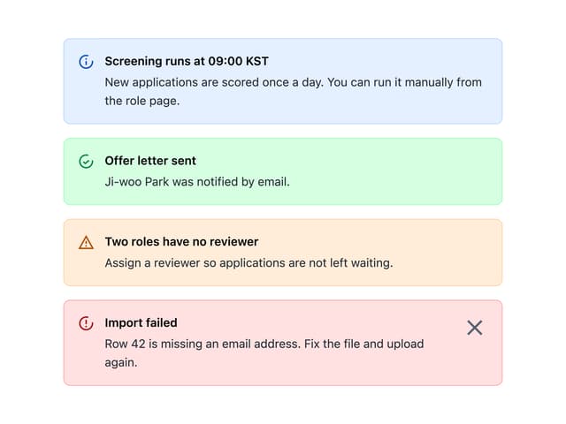
Alert
18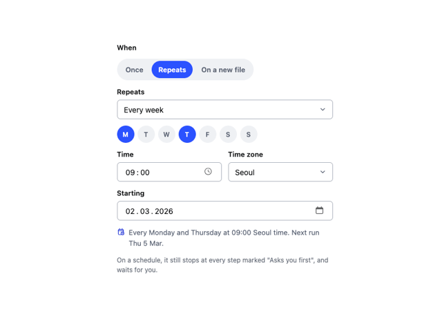
Schedule Picker
15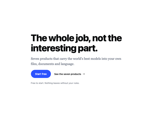
Hero Section
7
Switch
5
Status Card
4
Meter
2
Memory Scope
2
Accordion
2
More in Forms
View all

Premium Auth
496
Authentication Card
45

Login 1
52

Login 2
7

Form
32

Card Studio
41

Login Card
32

Form
136
