
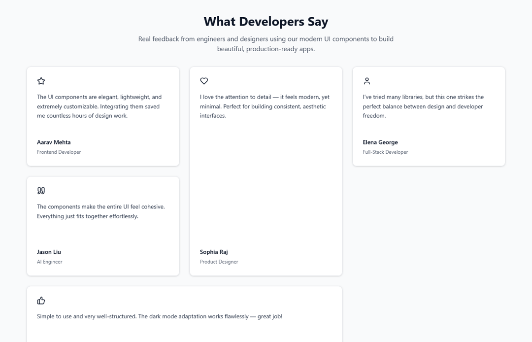
The BentoTestimonials component is a sleek, black-and-white testimonial grid designed to showcase user feedback in a modern, minimal, and responsive layout. Inspired by bento-style design, it arranges testimonial cards of varying sizes in a dense, asymmetric grid that fills space elegantly without leaving gaps. Each card features a Lucide icon, a short review, and the contributor’s name and role — all harmonized for both light and dark themes. This component is fully configurable, making it ideal for portfolios, landing pages, and product websites where you want to highlight authentic testimonials in a visually balanced and professional way.
Built with React and Tailwind. Copy the prompt and paste it into Claude Code, Cursor or Lovable: your agent adds BentoTestimonials to your project and fits it to your theme.
Code
How BentoTestimonials is used: the demo's code. The component's own source comes with a free account.
Usage.tsx
import { BentoTestimonials } from "@/components/ui/bento-testimonials";

export default function DemoBentoTestimonialsPage() {
  return (
    <div className="min-h-screen w-full bg-gray-50 dark:bg-[#0B0B0B] flex flex-col items-center justify-center p-8">
      <div className="max-w-6xl w-full space-y-8">
        <div className="text-center space-y-3">
          <h1 className="text-3xl font-bold text-gray-900 dark:text-white">
            What Developers Say
          </h1>
          <p className="text-gray-600 dark:text-gray-400 max-w-2xl mx-auto">
            Real feedback from engineers and designers using our modern UI components
            to build beautiful, production-ready apps.
          </p>
        </div>
        <BentoTestimonials />
      </div>
    </div>
  );
}
Dependencies
More by ruhith
View all
LoadingLines
145
Health Stat Card
138
LoadingRadar
119
LoadingBottle
114
BarLoader
90
Loader
71
BouncingCirclesLoader
50
LoaderProgressiveBar
49
More in Testimonials
View all

Testimonial
41
Testimonial 2
32

Staggered Testimonials Grid
143
testimonial
798
Testimonials Section
241
Testimonial Card
69
Testimonials Section
152

Testimonials
245


