
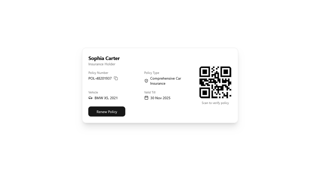
The PolicyPassCard is a modern, Shadcn UI–styled component designed to provide a clear, concise, and interactive summary of an insurance policy. It elegantly combines essential policy details, client information, and a scannable QR code for quick verification or access. The card is highly configurable, allowing developers to customize client data, policy specifics, QR code URL, and actions such as updating or viewing the policy. Built with accessibility and responsiveness in mind, it features smooth animations, tooltips for actionable elements like copyable policy numbers, and an organized layout for easy readability. This component is perfect for dashboards, customer portals, or mobile applications where users need quick access to policy information in a visually appealing, professional format.
Built with React and Tailwind. Copy the prompt and paste it into Claude Code, Cursor or Lovable: your agent adds PolicyPassCard to your project and fits it to your theme.
Code
How PolicyPassCard is used: the demo's code. The component's own source comes with a free account.
Usage.tsx
"use client"

import React from "react"
import { PolicyPassCard } from "@/components/ui/policy-pass-card"

const PolicyPassCardDemo = () => {
  const handleCopy = () => {
    alert("Policy number copied!")
  }

  const handleRenew = () => {
    alert("Redirecting to renewal page...")
  }

  return (
    <div className="flex min-h-screen items-center justify-center bg-background p-6">
      <PolicyPassCard
        holderName="Sophia Carter"
        policyNumber="POL-48201937"
        policyType="Comprehensive Car Insurance"
        vehicleName="BMW X5, 2021"
        validTill="30 Nov 2025"
        qrCodeUrl="https://api.qrserver.com/v1/create-qr-code/?size=150x150&data=POL-48201937"
        onCopyPolicy={handleCopy}
        onRenew={handleRenew}
      />
    </div>
  )
}

export default PolicyPassCardDemo
Dependencies
More by ruhith
View all
LoadingLines
145
Health Stat Card
138
LoadingRadar
119
LoadingBottle
114
BarLoader
90
Loader
71
BouncingCirclesLoader
50
LoaderProgressiveBar
49
More in Cards
View all
Stats cards with links
33

Course Design Cards
1.1K

Card
70
Statistics Card 2
264
Statistics Card 10
263

Card
17

Card Studio
9
The Item one
3
