About
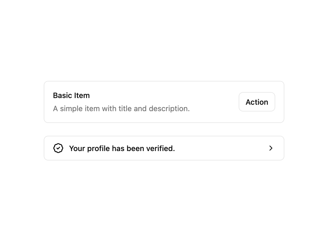
Here is Item component
Built with React and Tailwind. Copy the prompt and paste it into Claude Code, Cursor or Lovable: your agent adds Item to your project and fits it to your theme.
Code
How Item is used: the demo's code. The component's own source comes with a free account.
Usage.tsx
import { BadgeCheckIcon, ChevronRightIcon } from "lucide-react"

import { Button } from "@/components/ui/button"
import {
  Item,
  ItemActions,
  ItemContent,
  ItemDescription,
  ItemMedia,
  ItemTitle,
} from "@/components/ui/item"

export default function ItemDemo() {
  return (
    <div className="flex w-full max-w-md flex-col gap-6">
      <Item variant="outline">
        <ItemContent>
          <ItemTitle>Basic Item</ItemTitle>
          <ItemDescription>
            A simple item with title and description.
          </ItemDescription>
        </ItemContent>
        <ItemActions>
          <Button variant="outline" size="sm">
            Action
          </Button>
        </ItemActions>
      </Item>
      <Item variant="outline" size="sm" asChild>
        <a href="#">
          <ItemMedia>
            <BadgeCheckIcon className="size-5" />
          </ItemMedia>
          <ItemContent>
            <ItemTitle>Your profile has been verified.</ItemTitle>
          </ItemContent>
          <ItemActions>
            <ChevronRightIcon className="size-4" />
          </ItemActions>
        </a>
      </Item>
    </div>
  )
}
Dependencies
More by shadcn
View all

Navigation menu
768
Calendar with time pressets
503
Sidebar
339
Sonner
229
Chart
212
Icons
176
Dropdown Menu
148
Calendar with event slots
115
More in Cards
View all

Course Design Cards
1.1K
Stats cards with links
119

Statistics Card 2
258
Card
55
Statistics Card 7
288
The Item one
3

Card Studio
9

Weather Card
52
