
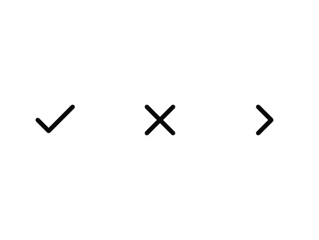
About
An inline icon wrapper that sizes any SVG glyph to the surrounding text's font size and color, used to drop a registry glyph or a custom SVG into a sentence or heading.
Built with React and Tailwind. Copy the prompt and paste it into Claude Code, Cursor or Lovable: your agent adds Icon to your project and fits it to your theme.
Code
How Icon is used: the demo's code. The component's own source comes with a free account.
Usage.tsx
import { Icon } from "@/components/ui/icon";

export default function IconDemo() {
  return (
    <p
      style={{
        margin: 0,
        display: "flex",
        alignItems: "center",
        gap: "var(--bs-space-4, 1rem)",
        color: "var(--foreground)",
      }}
    >
      <Icon name="check" label="Done" />
      <Icon name="x" label="Close" />
      <Icon name="chevron-right" label="Next" />
    </p>
  );
}
Dependencies
More by bysages
View all
Switch
13
Avatar Group
5
Spinner
4
Typography
3
Grid
Float Button
Timeline

Floating Panel