
About
A glossy, dark gradient button with built-in press and hover animation, used for hero calls-to-action or a single standout action.
Built with React and Tailwind. Copy the prompt and paste it into Claude Code, Cursor or Lovable: your agent adds Fancy Button to your project and fits it to your theme.
Code
How Fancy Button is used: the demo's code. The component's own source comes with a free account.
Usage.tsx
import { FancyButton } from "@/components/ui/fancy-button";

export default function FancyButtonDemo() {
  return (
    <div className="flex items-center justify-center">
      <FancyButton>Get Started</FancyButton>
    </div>
  );
}
Dependencies
More by cubby-ui
View all
Timeline
171
Copy Button
6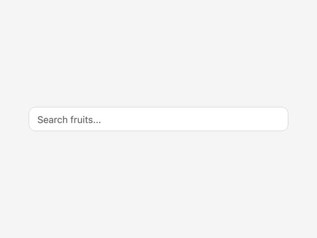
Autocomplete
4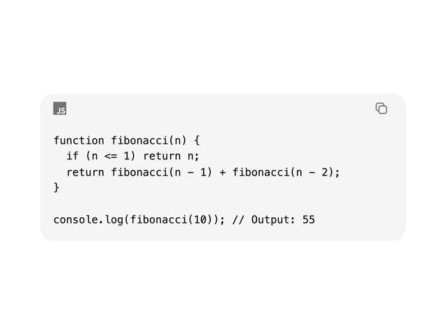
Code Block
Date Range Picker
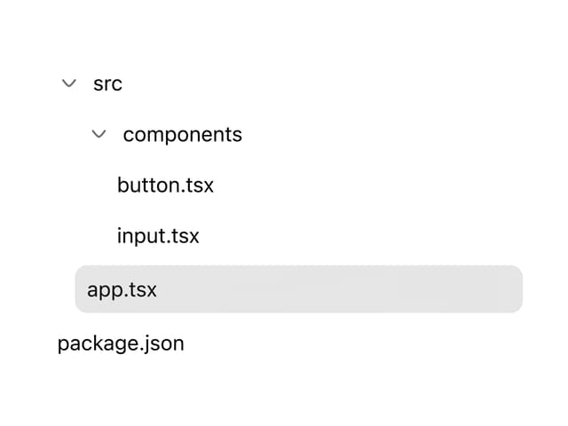
Tree
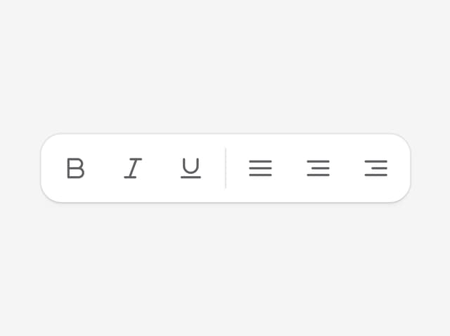
Toolbar
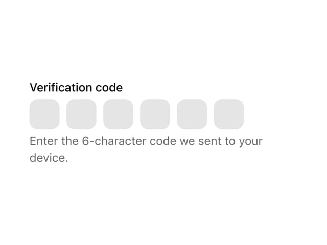
OTP Field
More in Heroes
View all

SaaS Template
2.4K

Responsive Hero Banner
2K

Hero
1.2K
Centered Hero with Image Fan
931
Editorial Collage Hero
430
Glass Fold
212

Minimalist Hero Fashion
285

HeroSectionWithGradient
336
