
About
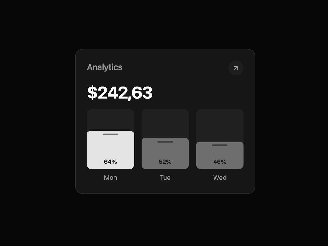
Analytics Card This component encapsulates the entire visual element, including the header, total amount, and the animated bar chart. It is designed to be highly reusable and theme-adaptive.
Built with React and Tailwind. Copy the prompt and paste it into Claude Code, Cursor or Lovable: your agent adds Card to your project and fits it to your theme.
Code
How Card is used: the demo's code. The component's own source comes with a free account.
Usage.tsx
import { AnalyticsCard } from '@/components/ui/card';
import { ArrowUpRight } from 'lucide-react'; // Example icon from lucide-react

// --- DEMO COMPONENT ---
// Provides a clean, centered preview of the AnalyticsCard.
const AnalyticsCardDemo = () => {
  // Sample data to be passed into the component via props.
  const sampleAnalyticsData = [
    { label: 'Mon', value: 64 },
    { label: 'Tue', value: 52 },
    { label: 'Wed', value: 46 },
  ];

  return (
    <div className="flex h-screen w-full items-center justify-center bg-background p-4">
      <AnalyticsCard
        title="Analytics"
        totalAmount="$242,63"
        icon={<ArrowUpRight className="h-4 w-4 text-muted-foreground" />}
        data={sampleAnalyticsData}
      />
    </div>
  );
};

export default AnalyticsCardDemo;
Dependencies
More by Kavi Katiyar
View all

3D Card
975
Bento Product Features
829
Testimonial Slider
714
Card
605
Order Confirmation Card
499
Project Detail View
408
State
393
Animated Card
391
More in Cards
View all
Stats cards with links
120

Course Design Cards
1.1K

Statistics Card 2
259
Card
56

Card Studio
9
Statistics Card 7
289
The Item one
3

Weather Card
53
