
About
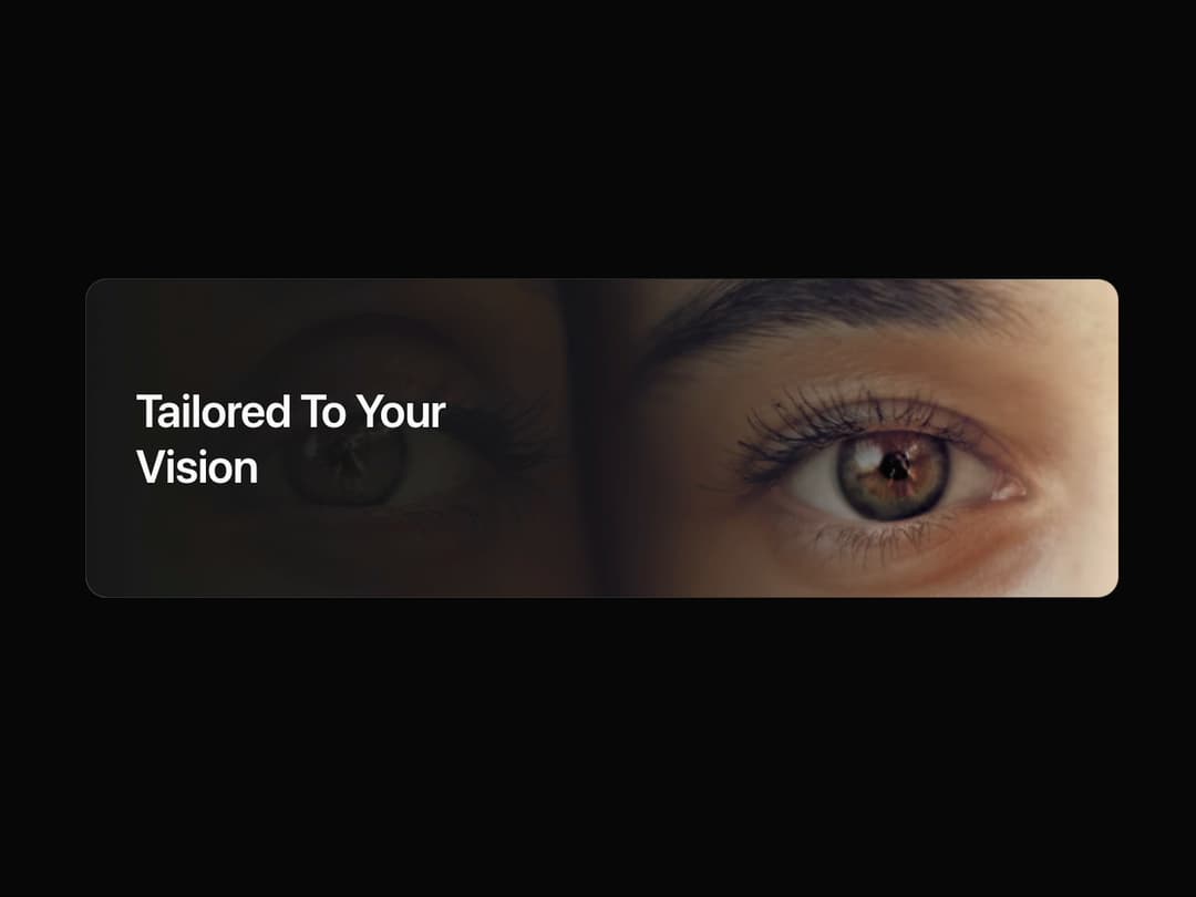
Vision Card Description: A visually striking card component that overlays text on a fading gradient, revealing a background image. It includes a subtle hover animation and supports both left and right text alignment for versatile use in hero sections or feature highlights.
Built with React and Tailwind. Copy the prompt and paste it into Claude Code, Cursor or Lovable: your agent adds Card to your project and fits it to your theme.
Code
How Card is used: the demo's code. The component's own source comes with a free account.
Usage.tsx
import { VisionCard } from '@/components/ui/card-10'; // Adjust this import path to where you save the component

export default function VisionCardDemo() {
  return (
    <div className="flex w-full flex-col items-center justify-center gap-8 bg-background p-4 antialiased md:p-8">
      {/* Example 1: Text on the left (default) */}
      <VisionCard
        title="Tailored To Your Vision"
        imageUrl="https://cdn.21st.dev/assets/mirror/79/7957b948e3c4af7576efb97f5cf877e7d12dfbc3d358ccff7aae9766d716ed3c.jpg"
        imageAlt="Close-up of a person's eye with a blue and brown iris."
        direction="left"
        aria-label="A card showing an eye with the text 'Tailored to your vision'"
      />
    </div>
  );
}More by LaviKatiyar
View all
Hero Section
801
Cards
564
Service Card
546
Card
505
Alert Toast
481
Bento Grid
381
Freelancer Profile Card
358
Referral Card
290
More in Heroes
View all

SaaS Template
2.4K

Responsive Hero Banner
2K

Hero
1.2K
Centered Hero with Image Fan
932
Editorial Collage Hero
431
Glass Fold
212

HeroSectionWithGradient
336

Aero Hero-3
559
