
About
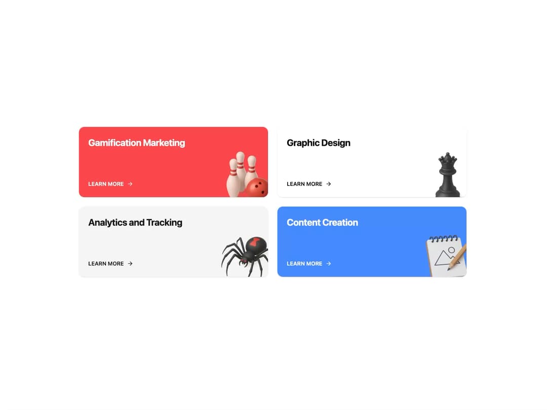
Service Card A visually engaging card component designed to showcase services or features. It includes a title, a call-to-action link, and a decorative image. The card features a subtle, fluid animation on hover to draw user attention.
Built with React and Tailwind. Copy the prompt and paste it into Claude Code, Cursor or Lovable: your agent adds Service Card to your project and fits it to your theme.
Code
How Service Card is used: the demo's code. The component's own source comes with a free account.
Usage.tsx
import { ServiceCard } from "@/components/ui/service-card";

const Demo = () => {
  const services = [
    {
      title: "Gamification Marketing",
      href: "/services/gamification",
      imgSrc: "https://www.thiings.co/_next/image?url=https%3A%2F%2Flftz25oez4aqbxpq.public.blob.vercel-storage.com%2Fimage-DFiJBJyUFg9QYTZOWEFeeza18HBnty.png&w=320&q=75",
      imgAlt: "Bowling pins and ball illustration",
      variant: "red",
    },
    {
      title: "Graphic Design",
      href: "/services/design",
      imgSrc: "https://www.thiings.co/_next/image?url=https%3A%2F%2Flftz25oez4aqbxpq.public.blob.vercel-storage.com%2Fimage-SxvnIpN2RVwLK77XxK3MnVCU6Xgc29.png&w=320&q=75",
      imgAlt: "Paint bucket illustration",
      variant: "default",
    },
    {
      title: "Analytics and Tracking",
      href: "/services/analytics",
      imgSrc: "https://www.thiings.co/_next/image?url=https%3A%2F%2Flftz25oez4aqbxpq.public.blob.vercel-storage.com%2Fimage-J7XYh5Cix5CceVeAtkuVXYSGgrhjDL.png&w=320&q=75",
      imgAlt: "Megaphone illustration",
      variant: "gray",
    },
    {
      title: "Content Creation",
      href: "/services/content",
      imgSrc: "https://www.thiings.co/_next/image?url=https%3A%2F%2Flftz25oez4aqbxpq.public.blob.vercel-storage.com%2Fimage-nY3Stc1545aP21dAi1IEbYlnc4rovS.png&w=320&q=75",
      imgAlt: "Notebook and pen illustration",
      variant: "blue",
    },
  ];

  return (
    <div className="w-full max-w-5xl mx-auto p-4">
      <div className="grid grid-cols-1 sm:grid-cols-2 gap-6">
        {services.map((service) => (
          <ServiceCard
            key={service.title}
            title={service.title}
            href={service.href}
            imgSrc={service.imgSrc}
            imgAlt={service.imgAlt}
            variant={service.variant as "red" | "default" | "gray" | "blue"}
            className="min-h-[180px]"
          />
        ))}
      </div>
    </div>
  );
};

export default Demo;
Dependencies
More by LaviKatiyar
View all
Hero Section
801
Cards
564
Card
505
Alert Toast
481
Bento Grid
381
Freelancer Profile Card
358
Referral Card
289
Menu
264
More in Features
View all

Features 8
3.1K
Features 2
322

Grid Feature Cards
1.9K

Feature Sections
52
Feature with advantages
278
Feature Section with card gradient
169
Feature Modern
17
Features 4
368


