
About
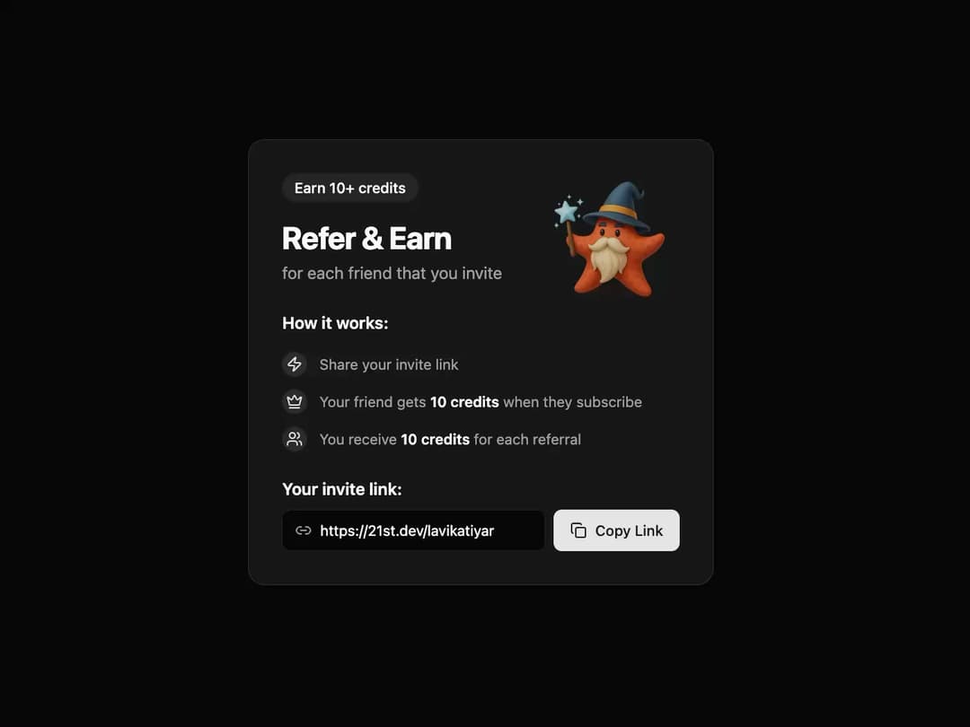
Referral Card This component provides a visually appealing and interactive card for referral programs. It uses framer-motion for smooth animations and is built with reusability in mind, allowing you to easily customize its content through props.
Built with React and Tailwind. Copy the prompt and paste it into Claude Code, Cursor or Lovable: your agent adds Referral Card to your project and fits it to your theme.
Code
How Referral Card is used: the demo's code. The component's own source comes with a free account.
Usage.tsx
import * as React from "react";
import { ReferralCard } from "@/components/ui/referral-card";
import { Zap, Crown, Users } from "lucide-react";

/**
 * A demo component to showcase the ReferralCard.
 */
const ReferralCardDemo = () => {
  // Data for the "How it works" section
  const referralSteps = [
    {
      icon: <Zap className="h-4 w-4" />,
      text: "Share your invite link",
    },
    {
      icon: <Crown className="h-4 w-4" />,
      text: (
        <>
          Your friend gets <span className="font-semibold text-card-foreground">10 credits</span>{" "}
          when they subscribe
        </>
      ),
    },
    {
      icon: <Users className="h-4 w-4" />,
      text: (
        <>
          You receive <span className="font-semibold text-card-foreground">10 credits</span> for
          each referral
        </>
      ),
    },
  ];

  return (
    <div className="flex min-h-[500px] w-full items-center justify-center bg-background p-4">
      <ReferralCard
        badgeText="Earn 10+ credits"
        title="Refer & Earn"
        description="for each friend that you invite"
        imageUrl="https://www.thiings.co/_next/image?url=https%3A%2F%2Flftz25oez4aqbxpq.public.blob.vercel-storage.com%2Fimage-v0vbLLyS37IDvS2JqhJONhIAEgpeZP.png&w=320&q=75" // Replace with your image link
        steps={referralSteps}
        referralLink="https://21st.dev/lavikatiyar"
      />
    </div>
  );
};

export default ReferralCardDemo;
Dependencies
More by LaviKatiyar
View all
Hero Section
801
Cards
564
Service Card
546
Card
505
Alert Toast
481
Bento Grid
381
Freelancer Profile Card
358
Menu
264
More in Cards
View all
Stats cards with links
33

Course Design Cards
1.1K

Card
70
Statistics Card 2
264
Statistics Card 10
263

Card
17

Card Studio
9
The Item one
3
