
About
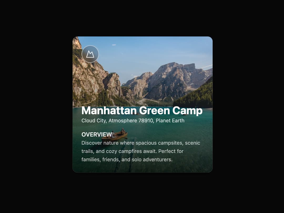
Travel Card This component encapsulates the visual representation of a travel destination. It is highly reusable, accepting props for the image, logo, text content, and pricing, making it adaptable for any similar use case. The advanced animation on hover provides a modern, interactive user experience.
Built with React and Tailwind. Copy the prompt and paste it into Claude Code, Cursor or Lovable: your agent adds Card to your project and fits it to your theme.
Code
How Card is used: the demo's code. The component's own source comes with a free account.
Usage.tsx
import { TravelCard } from "@/components/ui/card-7";
import { Mountain } from "lucide-react";
import { Toaster, toast } from "sonner";

// Demo component to showcase the TravelCard
export default function TravelCardDemo() {
  const handleBooking = () => {
    toast.success("Booking initiated!", {
      description: "Redirecting to booking page...",
    });
  };

  return (
    <>
      {/* The Toaster component is required to display the notifications */}
      <Toaster richColors />
      <div className="flex min-h-screen w-full items-center justify-center bg-background p-4">
        <TravelCard
          imageUrl="https://cdn.21st.dev/assets/mirror/33/3317c3e478b50a44ae6d8d639da282e4d1ced334f3b8cd7d2492613e5a5b6c9c.jpg"
          imageAlt="Misty mountains over a serene lake"
          logo={<Mountain className="h-6 w-6 text-white/80" />}
          title="Manhattan Green Camp"
          location="Cloud City, Atmosphere 78910, Planet Earth"
          overview="Discover nature where spacious campsites, scenic trails, and cozy campfires await. Perfect for families, friends, and solo adventurers."
          price={120}
          pricePeriod="Per Night"
          onBookNow={handleBooking}
          aria-label="Travel card for Manhattan Green Camp"
        />
      </div>
    </>
  );
}
Dependencies
More by LaviKatiyar
View all
Hero Section
801
Cards
564
Service Card
546
Alert Toast
481
Bento Grid
381
Freelancer Profile Card
358
Referral Card
289
Menu
264
More in Pricing
View all
Pricing Section
582

Pricing Section
173

Pricing Card
364
pricing section
157

Pricing Cards
86
Glowing Pricing Tiers
45
Colorful-Pricing
84
Single Pricing Card
794


