
About
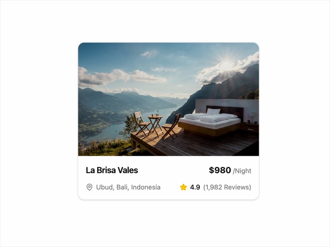
Property Card A visually polished card component designed to showcase properties, rentals, or listings. It features a responsive layout, theme support for light and dark modes, and subtle animations on hover and load.
Built with React and Tailwind. Copy the prompt and paste it into Claude Code, Cursor or Lovable: your agent adds Card to your project and fits it to your theme.
Code
How Card is used: the demo's code. The component's own source comes with a free account.
Usage.tsx
// demo.tsx
import { PropertyCard } from "@/components/ui/card-3"; // Adjust path as needed

const PropertyCardDemo = () => {
  return (
    <div className="flex h-full w-full items-center justify-center bg-background p-4">
      <PropertyCard
        imageUrl="https://cdn.21st.dev/assets/mirror/ee/ee498e62ac3db7a1f16eb122c547a47a425d51fd6086f30ef99e0ecd90ce7f78.jpg"
        name="La Brisa Vales"
        location="Ubud, Bali, Indonesia"
        price={980}
        rating={4.9}
        reviews={1982}
        imageAlt="Luxury villa with a pool surrounded by palm trees"
        aria-label="View details for La Brisa Vales in Ubud, Bali"
      />
    </div>
  );
};

export default PropertyCardDemo;
Dependencies
More by LaviKatiyar
View all
Hero Section
801
Cards
564
Service Card
546
Card
505
Alert Toast
481
Bento Grid
381
Freelancer Profile Card
358
Referral Card
289