
About
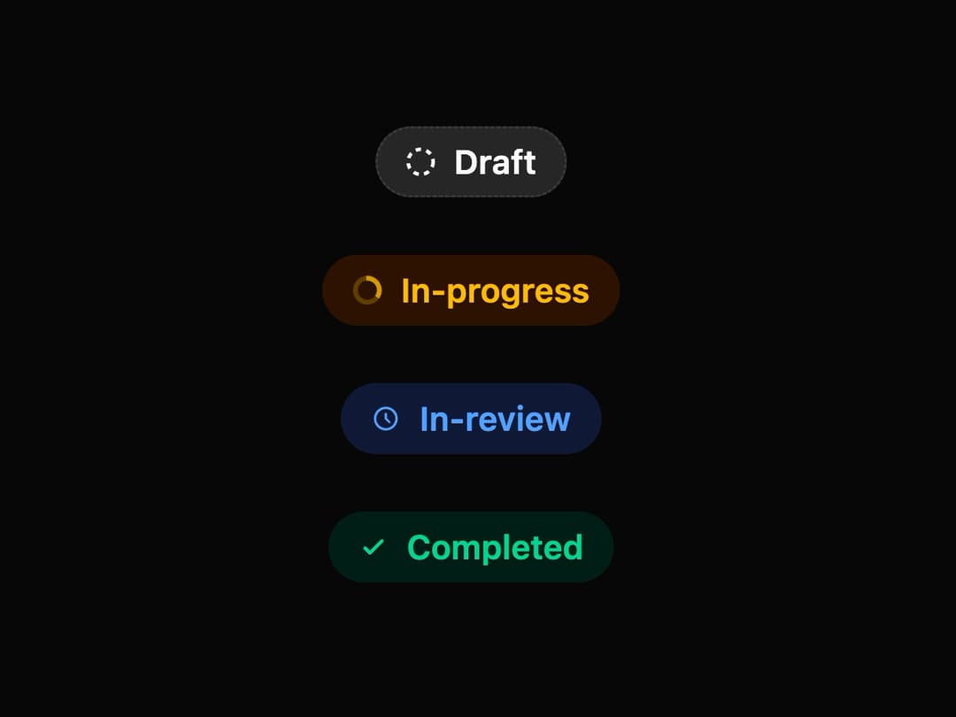
Status Badge A versatile badge component designed to visually represent various workflow states such as 'Draft', 'In-progress', 'In-review', and 'Completed'. It features distinct icons, colors, and subtle animations for each status, ensuring clarity and a modern user experience.
Built with React and Tailwind. Copy the prompt and paste it into Claude Code, Cursor or Lovable: your agent adds Status Badge to your project and fits it to your theme.
Code
How Status Badge is used: the demo's code. The component's own source comes with a free account.
Usage.tsx
import { StatusBadge } from "@/components/ui/status-badge";

const StatusBadgeDemo = () => {
  return (
    <div className="flex min-h-[250px] w-full flex-col items-center justify-center gap-6 rounded-lg bg-background p-8 md:flex-row">
      {/* Draft Status */}
      <StatusBadge status="draft" />

      {/* In-progress Status */}
      <StatusBadge status="in-progress" />

      {/* In-review Status */}
      <StatusBadge status="in-review" />

      {/* Completed Status */}
      <StatusBadge status="completed" />
    </div>
  );
};

export default StatusBadgeDemo;
Dependencies
More by LaviKatiyar
View all
Hero Section
801
Cards
564
Service Card
546
Card
505
Alert Toast
481
Bento Grid
381
Freelancer Profile Card
358
Referral Card
290