
About
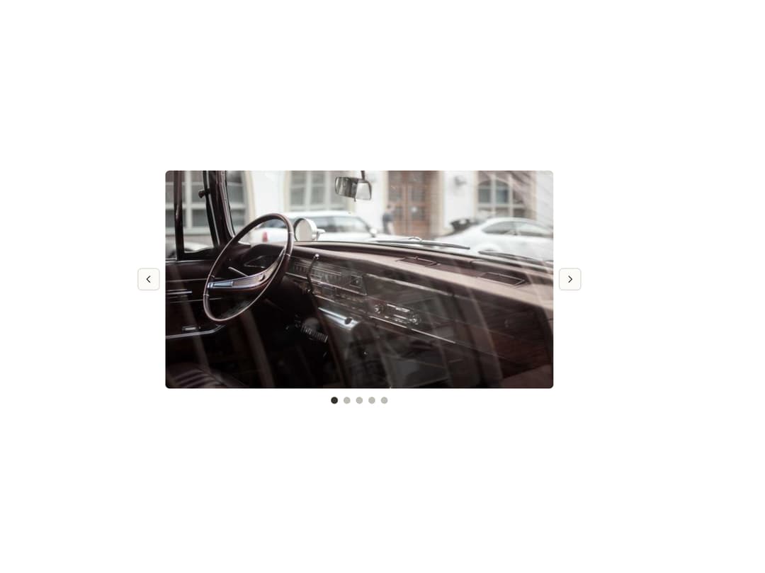
A touch and keyboard friendly image/content carousel with prev/next controls, page indicators, autoplay, and variable slide sizing.
Built with React and Tailwind. Copy the prompt and paste it into Claude Code, Cursor or Lovable: your agent adds Carousel to your project and fits it to your theme.
Code
How Carousel is used: the demo's code. The component's own source comes with a free account.
Usage.tsx
"use client";

import { Carousel } from "@/components/ui/carousel";

const slides = [
  { src: "https://cdn.21st.dev/assets/mirror/1c/1c291ce0b4b15118027e60fd36f24ab5048ac02c3c96566e08be415b67f2553d.jpg", alt: "Mountain path" },
  { src: "https://cdn.21st.dev/assets/mirror/b4/b41c65d9c014e4fa2edcf50069563560ab3b5ef7301383b9fd5f35fa41632539.jpg", alt: "Coastal cliff" },
  { src: "https://cdn.21st.dev/assets/mirror/94/94a1b596881599198b98fae7532fd37fb03e64219701210746991a9e9f427433.jpg", alt: "Forest canopy" },
  { src: "https://cdn.21st.dev/assets/mirror/b1/b1473769fd715759403582888a204ede558af93a6f6251bba114dd02a29a29e6.jpg", alt: "River bend" },
  { src: "https://cdn.21st.dev/assets/mirror/2a/2a7b4e0e3fcbe8ad2973ba26a660d44c2e93c7254f2465ac6d23507c80794c46.jpg", alt: "Valley fog" },
];

function Chevron({ dir }: { dir: "left" | "right" }) {
  return (
    <svg
      width={16}
      height={16}
      viewBox="0 0 24 24"
      fill="none"
      stroke="currentColor"
      strokeWidth={1.75}
      aria-hidden="true"
      style={dir === "left" ? { transform: "rotate(180deg)" } : undefined}
    >
      <path d="m9 5 7 7-7 7" />
    </svg>
  );
}

export default function CarouselDemo() {
  return (
    <div style={{ width: "100%", maxWidth: "640px" }}>
      <Carousel.Root slideCount={slides.length} orientation="horizontal">
        <Carousel.Control>
          <Carousel.PrevTrigger>
            <Chevron dir="left" />
          </Carousel.PrevTrigger>
          <Carousel.ItemGroup>
            {slides.map((slide, index) => (
              <Carousel.Item key={index} index={index}>
                <img src={slide.src} alt={slide.alt} width={640} height={360} />
              </Carousel.Item>
            ))}
          </Carousel.ItemGroup>
          <Carousel.NextTrigger>
            <Chevron dir="right" />
          </Carousel.NextTrigger>
        </Carousel.Control>
        <Carousel.IndicatorGroup>
          {slides.map((_, index) => (
            <Carousel.Indicator key={index} index={index} />
          ))}
        </Carousel.IndicatorGroup>
      </Carousel.Root>
    </div>
  );
}
Dependencies
More by bysages
View all
Switch
13
Avatar Group
5
Typography
4
Spinner
4
Grid
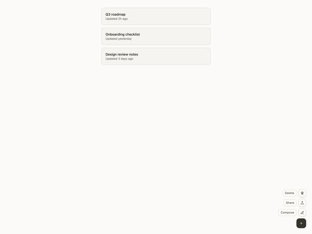
Float Button
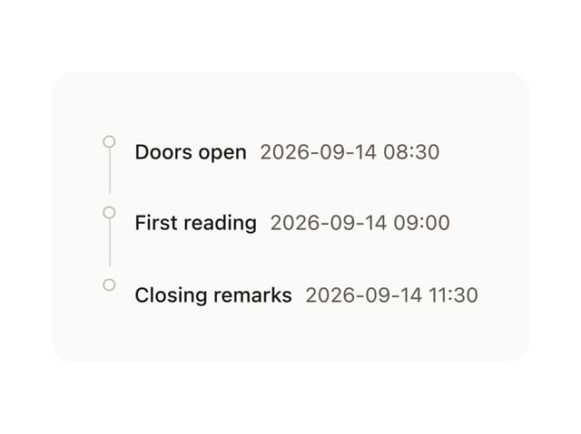
Timeline

Floating Panel
More in Galleries
View all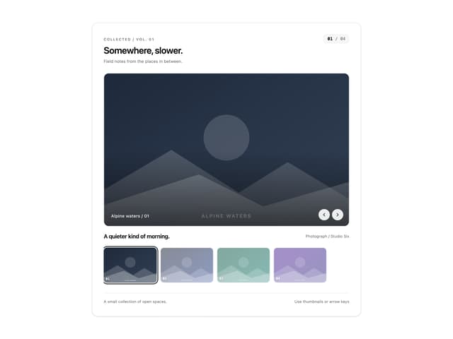
Thumbnail image viewer
43

Animated Gallery
1.4K

File Upload
18
Editorial Collage Hero
430
3D Parallax Unfurling Gallery
981

Image Gallery
123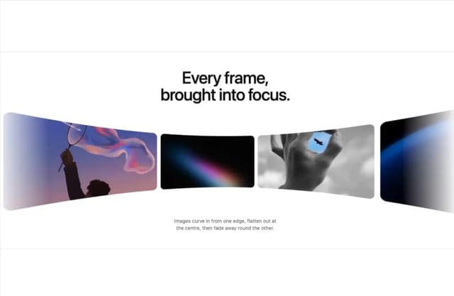

Tilted Grid Hero
1.5K

Elastic Gallery
908

