

About
Animated border beam effect for cards and surfaces — rotate, pulse-inner, pulse-outside, or trace styles, with per-color-variant and light/dark tuning.
Built with React and Tailwind. Copy the prompt and paste it into Claude Code, Cursor or Lovable: your agent adds Animated Border Beam to your project and fits it to your theme.
Code
How Animated Border Beam is used: the demo's code. The component's own source comes with a free account.
Usage.tsx
"use client";

import BeamBorder, { type BeamBorderProps } from "@/components/ui/border-beam";

const settings = {
  size: "md",
  colorVariant: "colorful",
  theme: "auto",
  active: true,
  strength: 2,
  duration: 3.3,
  beamWidth: 2,
  backgroundColor: "#212121",
};

export default function BorderBeamDemo(props: Partial<typeof settings>) {
  const s = { ...settings, ...props };
  return (
    <main className="flex min-h-screen w-full items-center justify-center bg-background p-10">
      <BeamBorder
        size={s.size as BeamBorderProps["size"]}
        colorVariant={s.colorVariant as BeamBorderProps["colorVariant"]}
        theme={s.theme as BeamBorderProps["theme"]}
        active={s.active}
        strength={s.strength}
        duration={s.duration}
        beamWidth={s.beamWidth}
        className="w-full max-w-sm"
      >
        <div
          className="relative flex flex-col gap-4 rounded-2xl p-8 text-white"
          style={{ backgroundColor: s.backgroundColor }}
        >
          <p className="text-xs font-bold uppercase tracking-[0.12em] text-[#66D933]">Featured</p>
          <h2 className="text-2xl font-medium leading-tight">A border that never sits still.</h2>
          <p className="text-sm text-white/60">
            Wrap any card or button in an animated glow — rotate, pulse, or trace the edge, tuned per theme.
          </p>
          <button
            type="button"
            className="mt-2 w-fit rounded-lg bg-white px-4 py-2 text-sm font-medium text-black transition-transform hover:scale-105 active:scale-95"
          >
            Explore
          </button>
        </div>
      </BeamBorder>
    </main>
  );
}
More by Hyperiux Vault
View all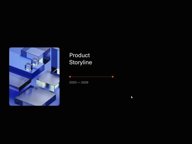

Product Timeline
2.3K
Stack Spread
1.3K
Arrow Fill Button
912
Interactive List Preview
869
Shiny Button
750
Circular Split Roll
641
Zoom Slider
430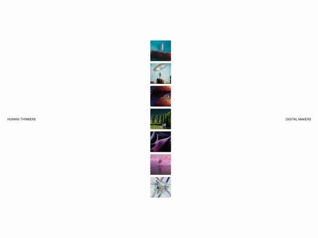
Stack Loader
371
More in Cards
View all

Statistics Card 2
264

Course Design Cards
1.1K
Card
70
Stats cards with links
39
The Item one
3

Card Studio
7
Statistics Card 7
292

Item
10
