
About
Feature Card
Built with React and Tailwind. Copy the prompt and paste it into Claude Code, Cursor or Lovable: your agent adds Feature Card to your project and fits it to your theme.
Code
How Feature Card is used: the demo's code. The component's own source comes with a free account.
Usage.tsx
import React from 'react';
import { motion } from 'framer-motion';
import { FeatureCard } from '@/components/ui/feature-card'; // Adjust the import path as needed

// Data for the feature cards
const features = [
  {
    icon: (
      <img
        src="https://www.thiings.co/_next/image?url=https%3A%2F%2Flftz25oez4aqbxpq.public.blob.vercel-storage.com%2Fimage-XimLfa9nmGlBpUT8xFkxuwQFz2hhXO.png&w=320&q=75"
        alt="Experience Icon"
        className="h-12 w-12"
      />
    ),
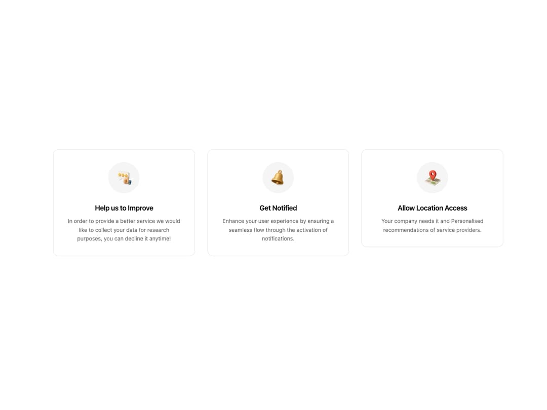
    title: "Help us to Improve",
    description: "In order to provide a better service we would like to collect your data for research purposes, you can decline it anytime!",
  },
  {
    icon: (
       <img
        src="https://www.thiings.co/_next/image?url=https%3A%2F%2Flftz25oez4aqbxpq.public.blob.vercel-storage.com%2Fimage-CK4odMSKWdmIj0ueBtNq9HOZR6Fbgv.png&w=320&q=75"
        alt="Notification Icon"
        className="h-12 w-12"
      />
    ),
    title: "Get Notified",
    description: "Enhance your user experience by ensuring a seamless flow through the activation of notifications.",
  },
  {
    icon: (
       <img
        src="https://www.thiings.co/_next/image?url=https%3A%2F%2Flftz25oez4aqbxpq.public.blob.vercel-storage.com%2Fimage-JgVvskF7j2zQ9LmIWmnCHHInmpJcTJ.png&w=320&q=75"
        alt="Location Icon"
        className="h-12 w-12"
      />
    ),
    title: "Allow Location Access",
    description: "Your company needs it and Personalised recommendations of service providers.",
  },
];

// Animation variants for the container and items
const containerVariants = {
  hidden: { opacity: 0 },
  visible: {
    opacity: 1,
    transition: {
      staggerChildren: 0.2,
    },
  },
};

const itemVariants = {
  hidden: { y: 20, opacity: 0 },
  visible: {
    y: 0,
    opacity: 1,
    transition: {
      duration: 0.5,
      // CORRECTED: Replaced the invalid cubic-bezier array with a standard easing function.
      ease: "easeOut",
    },
  },
};

/**
 * A demo component to display a grid of animated FeatureCards.
 */
const FeatureCardDemo = () => {
  return (
    <div className="w-full bg-background text-foreground p-8 md:p-12">
      <motion.div
        className="grid grid-cols-1 md:grid-cols-2 lg:grid-cols-3 gap-8 max-w-6xl mx-auto"
        initial="hidden"
        animate="visible"
        variants={containerVariants}
      >
        {features.map((feature, index) => (
          <motion.div key={index} variants={itemVariants}>
            <FeatureCard
              icon={feature.icon}
              title={feature.title}
              description={feature.description}
            />
          </motion.div>
        ))}
      </motion.div>
    </div>
  );
};

export default FeatureCardDemo;More by LaviKatiyar
View all
Hero Section
801
Cards
564
Service Card
546
Card
505
Alert Toast
481
Bento Grid
381
Freelancer Profile Card
358
Referral Card
289
More in Features
View all

Features 8
3.1K
Features 2
322

Grid Feature Cards
1.9K

Feature Sections
52
Feature with advantages
278
Feature Section with card gradient
169
Feature Modern
17
Features 4
368


