
About
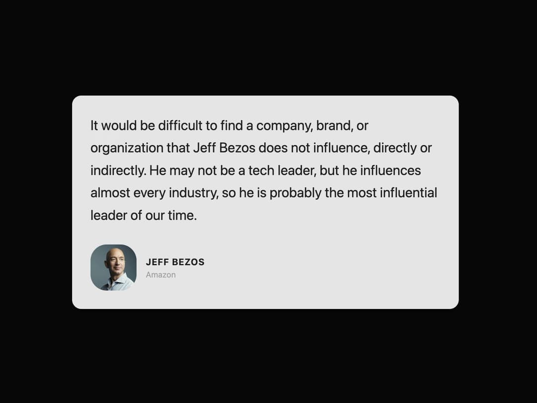
Testimonial Card A visually appealing card component designed to display testimonials or quotes. It features an author's image, name, title, and the quote itself, styled to be modern and clean. The component is fully responsive, supports light and dark themes using shadcn/ui variables, and includes a subtle entry animation.
Built with React and Tailwind. Copy the prompt and paste it into Claude Code, Cursor or Lovable: your agent adds Testimonial to your project and fits it to your theme.
Code
How Testimonial is used: the demo's code. The component's own source comes with a free account.
Usage.tsx
import { TestimonialCard } from '@/components/ui/testimonial-1'; // Adjust the import path as needed

export default function TestimonialCardDemo() {
  return (
    <div className="flex min-h-[550px] w-full items-center justify-center bg-background p-4">
      <TestimonialCard
        variant="primary" // Using 'primary' variant to match the blue theme from the image
        quote="It would be difficult to find a company, brand, or organization that Jeff Bezos does not influence, directly or indirectly. He may not be a tech leader, but he influences almost every industry, so he is probably the most influential leader of our time."
        authorName="Jeff Bezos"
        authorImage="https://encrypted-tbn0.gstatic.com/images?q=tbn:ANd9GcQV76vYTIt0RLq_eKkHexACNqbKppcQC778weqFgiCJ_IQtEj8Ykqomzy5i9SolG3oYO3U&usqp=CAU" // Placeholder image URL
        authorTitle="Amazon"
        className="text-white" // Custom class for specific styling needs if required
      />
    </div>
  );
}
Dependencies
More by LaviKatiyar
View all
Hero Section
801
Cards
564
Service Card
546
Card
505
Alert Toast
481
Bento Grid
381
Freelancer Profile Card
358
Referral Card
289
More in Testimonials
View all

Testimonial
41
Testimonial 2
32

Staggered Testimonials Grid
143
testimonial
797
Testimonials Section
241
Testimonial Card
69
Testimonials Section
152

Testimonials
245


