
About
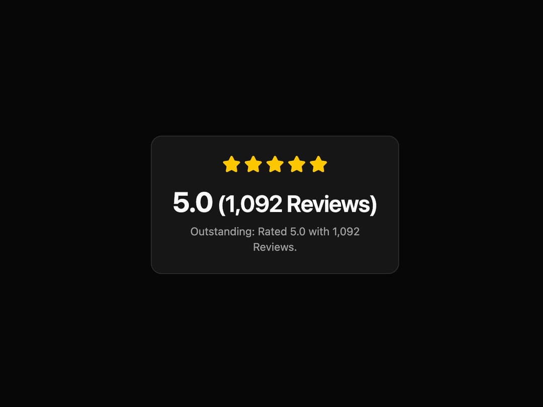
Review Summary Card This component provides an animated display for product or service ratings. It features a count-up animation for the rating and review numbers and a staggered animation for the stars, making the presentation dynamic and engaging.
Built with React and Tailwind. Copy the prompt and paste it into Claude Code, Cursor or Lovable: your agent adds Card to your project and fits it to your theme.
Code
How Card is used: the demo's code. The component's own source comes with a free account.
Usage.tsx
import { ReviewSummaryCard } from '@/components/ui/card-2'; // Adjust the import path

/**
 * A demo component to showcase the ReviewSummaryCard.
 */
const ReviewSummaryCardDemo = () => {
  return (
    <div className="flex h-full w-full items-center justify-center bg-background p-4">
      <ReviewSummaryCard
        rating={5.0}
        reviewCount={1092}
        summaryText="Outstanding: Rated 5.0 with 1,092 Reviews."
      />
    </div>
  );
};

export default ReviewSummaryCardDemo;
Dependencies
More by LaviKatiyar
View all
Hero Section
801
Cards
564
Service Card
546
Card
505
Alert Toast
481
Bento Grid
381
Freelancer Profile Card
358
Referral Card
289
More in Cards
View all

Statistics Card 2
264

Course Design Cards
1.1K
Card
70
Stats cards with links
39
The Item one
3

Card Studio
7
Statistics Card 7
292

Item
10
